I’m learning how to draw upside-down, and it’s actually pretty tempting to rotate the canvas (?) I tried to stick with the original canvas orientation and learned how to draw human figure when they are looking up. It’s definitely a difficult task. Also, water reflection and texture (to show it’s, well, “water” as in water puddle in the middle of the road.)
I feel this is one of those works that I will look back later far in the future and getting myself a massive cringe. Oh well, here’s for more practices!
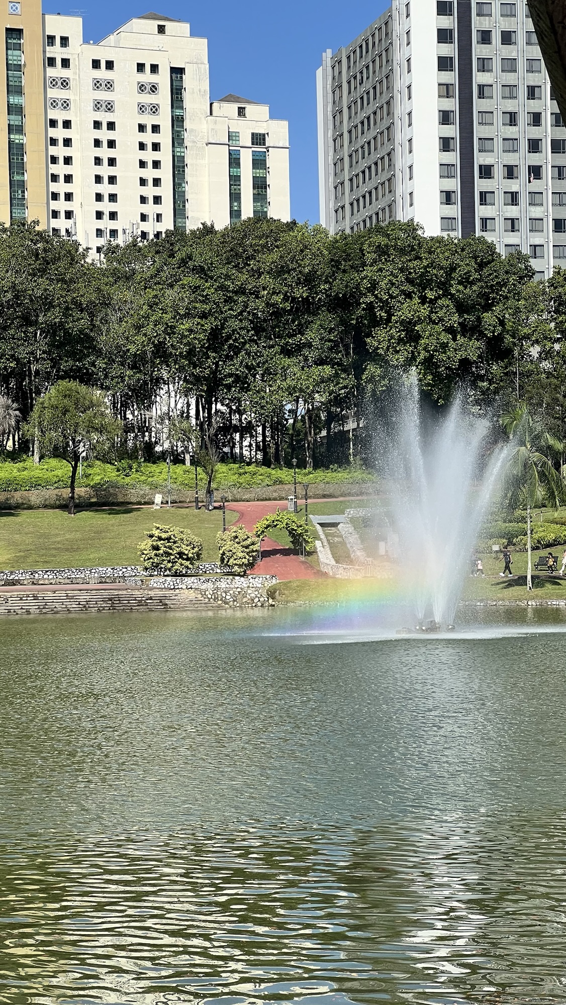
One of the funniest ironies I ever endured was (or is?) whenever foreign friends (not residing in Indonesia or Malaysia) asked me/told me, “hey! I went to this so-and-so place in your country!” while me, an Indonesian and an Indonesian-in-Malaysia-since-2014, is actually never been to that place.
“Hey, Retno! I’m in Indonesia right now! I’m in Lombok!”
Me. Never been to Lombok despite the island being one of the top tourist destinations after Bali and Yogyakarta AND LOCATED IN MY OWN COUNTRY: “Cool!”
“Hey, Retno! I’m in Malaysia! I’m hiking in Mount Kinabalu!”
Me. Only heard the stories of Sabah and Sarawak from my husband as his work requires him to do occasional trip to Miri, Sarawak: “Nice!”
Somehow, even my friends from the other countries know my country better than I do ?
Also, I’ve been living here in Kuala Lumpur for 8 years. Guess what? I never been to KL Tower and crossing the Twin Towers’ bridge.
A couple of days ago, I saw a Tiktok video by Yoshi Yoshitani, one of the artists I respect so very much. In the video, Yoshi discussed about values in color, and I got intrigued. So, yeah, here it is ?
I started with the outline.
Then, I added the layers with B/W/grayscale color to determine the values.
Determining value is crucial and helpful if you want to build focus on your art. Meaning that, you know which area you want your viewers to see first. The main character(s).
I’ve been struggling with “flatness” on my works, and for most of the times, I didn’t know why and how it happened. There are tons of artworks out there that superbly executed, balanced between light and shadow and drama. Thanks to Yoshi’s Tiktok video, I learned A LOT in 5 minutes (I wonder if Yoshi has online courses I can enroll? It can be a good activity to do during my sabbatical in 2024!)
I want to focus on the mice, so I added the high value on them and the supporting items as the foreground characters.
Then, I determined the background — specifically, the darker ones. This should help to pop up the main characters and serve to its purpose: Background.
Once I’m satisfied with the values, I added the colors. Here it is!
This is still far from perfect, but I’m so happy with the result! A bit of note; when I colored the areas, I did it on top of the grayscale layers so I won’t forget which areas with specific values. When I hide the grayscale layers, I was so pleasantly surprised to see the drawings looking like children storybook!
This is so exciting. I’m so happy and I’m excited to learn more.
Nindya’s quick blurbs
A month too late, but I just stumbled upon IKEA France’s Tiktok video, hinting a possible collab with Animal Crossing. Unfortunately, no further information about this other than IGN picked up this news when the video was posted.