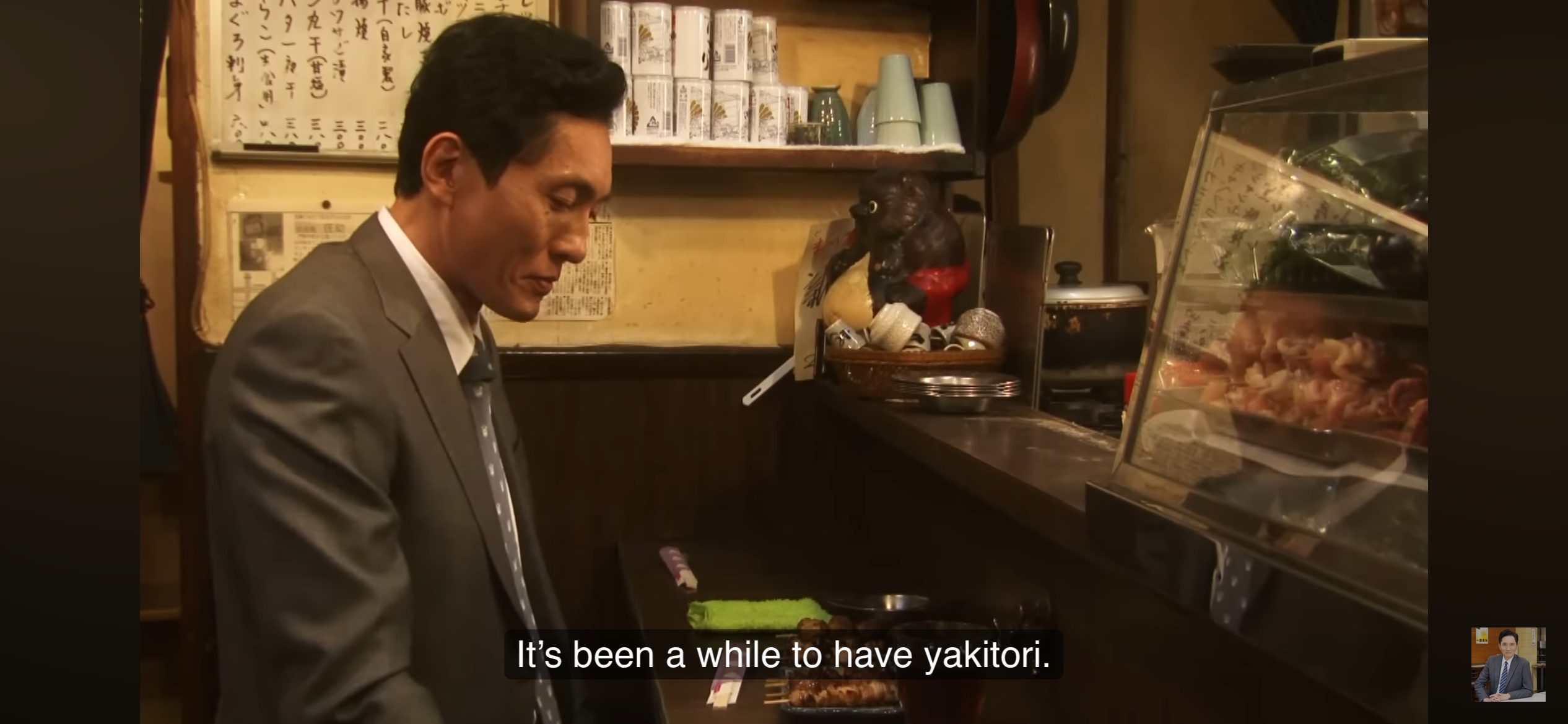
Last night, I scrolled on my YouTube app to find something to watch (I have been working on spending more time at long-form media instead of quick dopamine hits/doomscrolling) when I found that TV Tokyo has been uploading full episodes of “Solitary Gourmet” on YouTube. This series is one of my favorites, and I mentioned it once on this blog as one of the recommendations.
I used to watch this series back in Indonesia on the WakuWaku Japan channel. That channel, alongside NHK World, was one of my favorites, and I used to watch it while having lunch with Wira when he was still a baby, hahah.
On YouTube, you can choose to have the English-dubbed dialogue or the original Japanese language and have the Closed Captioning (CC) feature active and set to English, which, I did the latter. I always feel that watching series with its original language is the way to go as the dialogue and expressions conveyed better.
However, I must inform you that with all other Japanese works, there’s always a catch — and I really don’t understand why they keep doing this: For international viewers, only the first season is available. For some reason, videos from other seasons are hidden.
Why I said, “– they keep doing this”, is because historically, J-entertainment has been making it hard for itself to open up to the international market. Back when I was still in uni, it was always either you buy original music CDs online from Taiwan or China at an exorbitant price, or go to some “music stores” in some dingy alleys in Jakarta selling CD music with a sign “kualitas ori” (“original quality”) written on it. Things have been much better now, yes, but it still has its own hurdles. I’m honestly hoping that Netflix would take this series, though. I mean, it’s like the last cry for help since I mentioned Netflix.
I used to bake a lot. Despite my usual protests and grievances about baking, as baking is a precise art whereas cooking is a whole YOLO approach, I used to bake because I felt like we could always have more spinach quiche and chewy chocolate cookies in the world. That said, I stopped baking back in 2019, “coincidentally” with the time I started my job at Automattic, since the job occupied most of my time and energy.
Fast forward to 2026, now I have a teenager and a pre-teen in the house, and anyone with teenagers growing up would know that the concept of the digestive system is nonexistent for them, as their whole being seems to consist of multiple black holes of the galaxies. RIP our grocery shopping budget. Hence: Baking. Homecooked meals and snacks.
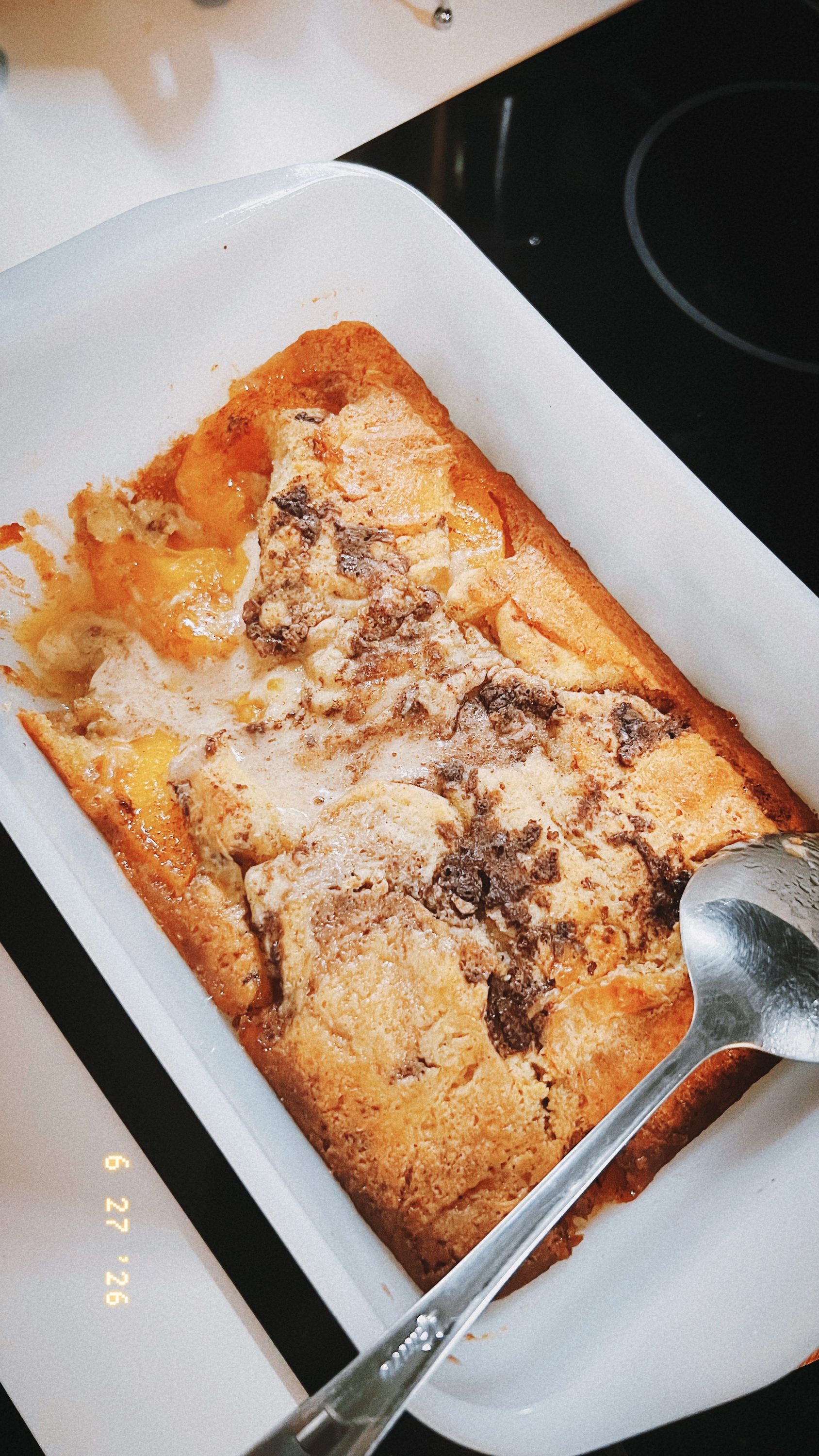
I (re)started with the easy ones: Peach cobbler.
The recipe was from Khairul Aming, a Malaysian food content creator and businessperson. He is really famous in Malaysia with his “30 Hari 30 Resepi” (Thirty Days, Thirty Recipes) during Ramadan, and this one, peach cobbler, is from this year’s series: Peach Cobbler Resepi Mudah untuk Moreh.
I personally love this recipe because it’s pretty easy and you don’t have to be super precise in measurement. It’s also quite forgiving in a sense that you can use canned peaches and still get a really nice dessert afterwards. Most of the ingredients mentioned are easy to be found in Malaysian and Indonesian supermarkets, too.
Next would be Betty Crocker’s chocolate chip cookie premix. Premix, because I initially bought it for the kids’ previous term break so Rey could have some activities at home, but the break passed by with the premix package still sitting nicely in our pantry. While the premix helped with make things waaaaay easier, it reminds me of why I am not super favorable to chocolate chocolate (yes, two “chocolates”) chip cookies. Reason being: It’s hard for me to see whether the cookies are ready or not.
Thankfully, my kids didn’t really complain much about the cookies. They still managed to polish off the cookies in no time as their after-school snack.
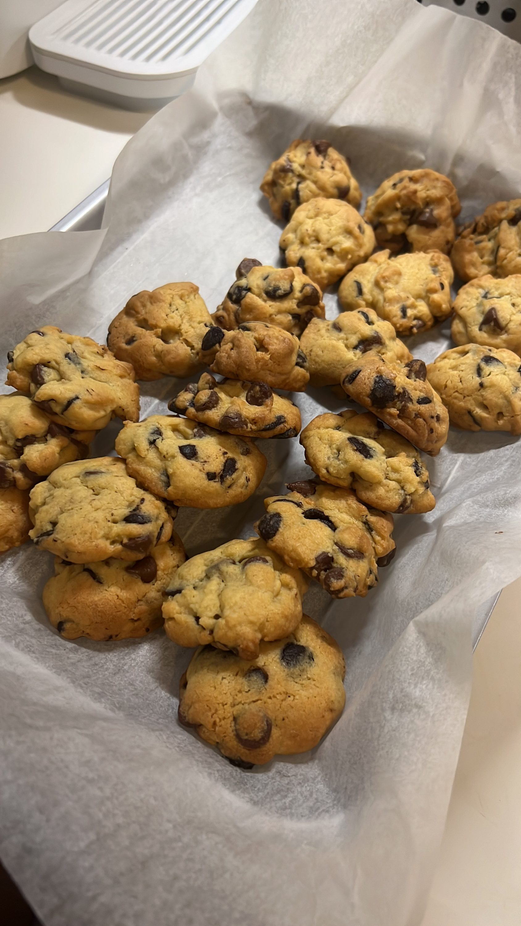
And just yesterday, I baked my own chocolate chip cookies. The recipe is from Sally’s Baking: Chewy Chocolate Chip Cookies. Chewy chocolate chip cookies are our favorite, and this recipe is the recipe I have been holding on to for years.
My goal with the cookies is to have them as “snack of the week”, but since I just saw Rey finish a whole small jar of cookies in one go for breakfast (we got like three-ish jars of cookies), I honestly doubt that the cookies would manage to get through this weekend. I do have a plan to bake sticky date pudding, though!
I honestly can see why it’s written “the best of Poirot” on the box jacket, because they are! In no particular order:
The Favorite: “Murder on the Orient Express”. No explanation needed. I love Orient Express (when yah…) and say what you want about the 2017 movie, but I love how Kenneth Brannagh brought out Poirot Universe with such lush.
The Most Mind-blowing: “The Murder of Roger Ackroyd”
Best Women Characters: “Five Little Pigs”
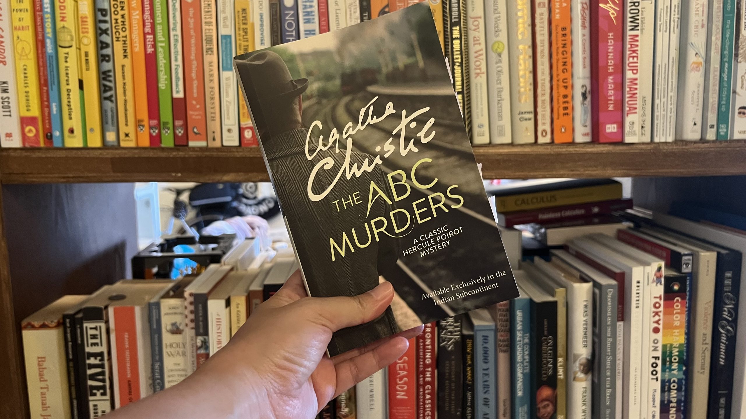
The Trickiest: “The ABC Murders”
“The ABC Murders” is such a page-turner. I forced myself to stay awake in the middle of the night to finish the rest of the novel in one go because I got so engrossed in how Agatha Christie could make such a twist. I particularly love how she imbued deep personalities into her characters, and from the five novels in the book, it seems like “The ABC Murders” is the one with such heavy emphasis on suspect profiling.
Poirot did not answer at once. Then he said slowly:
‘The answer to that is yes. We are confronted here by an unknown personage. He is in the dark and seeks to remain in the dark. But in the very nature of things he cannot help throwing light upon himself. In one sense we know nothing about him — in another sense we know already a good deal. I see his figure dimly taking shape — a man who prints clearly and well — who buys good-quality paper — who is at great needs to express his personality. I see him as a child possibly ignored and passed over — I see him growing up with an inward sense of inferiority — warring with a sense of injustice…’
I know that we have various classic detective literature mentioning or having a brush with suspect profiling and psychology, but it’s quite rare to see such emphasis shown as clear as the one in “The ABC Murders”. I also particularly love Poirot’s obsession with the suspect motives — “the why”. It feels like a good catharsis for a girl who was usually being told “don’t ask too many questions!” growing up. Yeah, I know I shouldn’t ask too many questions. But why?
I’m particularly interested in one of the characters here: Mademoiselle Thora Grey. I love the juxtaposition presented in the story: Hastings’ fascination with Ms. Grey, and her own personality and mind on the possibility of receiving the wealth in front of her. The interactions made me wonder if this is a show of Hastings’ poor judgment of women, in how he might still see them as “the weaker sex”, or whether Ms. Gray is that good in concealing her thoughts and intentions.
Speaking of “seeing women as the weaker sex”, of course I couldn’t hold my snort when Poirot stressed the possibility of women, too, can be murderer:
‘Then the murderer could just as well be a woman as a man?’
The suggestion took the doctor somewhat aback.
‘A woman, eh? Well, I confess it never occurred to me to connect a woman with this type of crime. But of course it’s possible — perfectly possible. Only, psychologically speaking, I shouldn’t say this was a woman’s crime.’
Poirot nodded his head in eager agreement.
‘Perfectly, perfectly. On the face of it, highly improbable. But one must take all possibilities into account.’
I found Poirot’s perspective interesting, because while it can be really easy to slip into misogyny, Poirot’s distrust of women (a.k.a. believing that women, too, could kill) came from valid reasons. I mean, this guy had been seeing, what? How many murders have been committed by women? So, yeah, I really appreciate how Poirot looked at a bashed head hit by a blunt object, and instead of going, “women would never do this! They would go for a more delicate attempt such as poison!”, he went, “huh. Okay. Can be a man, can be a woman. I mean, pick your choice.” It feels like Agatha Christie spoke to us, “heck yeah, I would do that given the opportunity.”
There were not a lot of scenes or shows of the usual The Girls of Agatha Christie in this work; for some reason, I felt that this work got overpowered by the characters from the Scotland Yard, particularly the “oh, yes?”-character of Inspector Crome. It feels like watching a really frustrating US-based series/movies with boisterous and loud military or police characters while the scientists and folks who actually know things have to work twice as hard to get their point across (cue all natural disaster movies by Hollywood).
Anyway! I don’t think I could write more about this work, mostly for fear of giving away things one too many, hahah!
What’s next on the list?
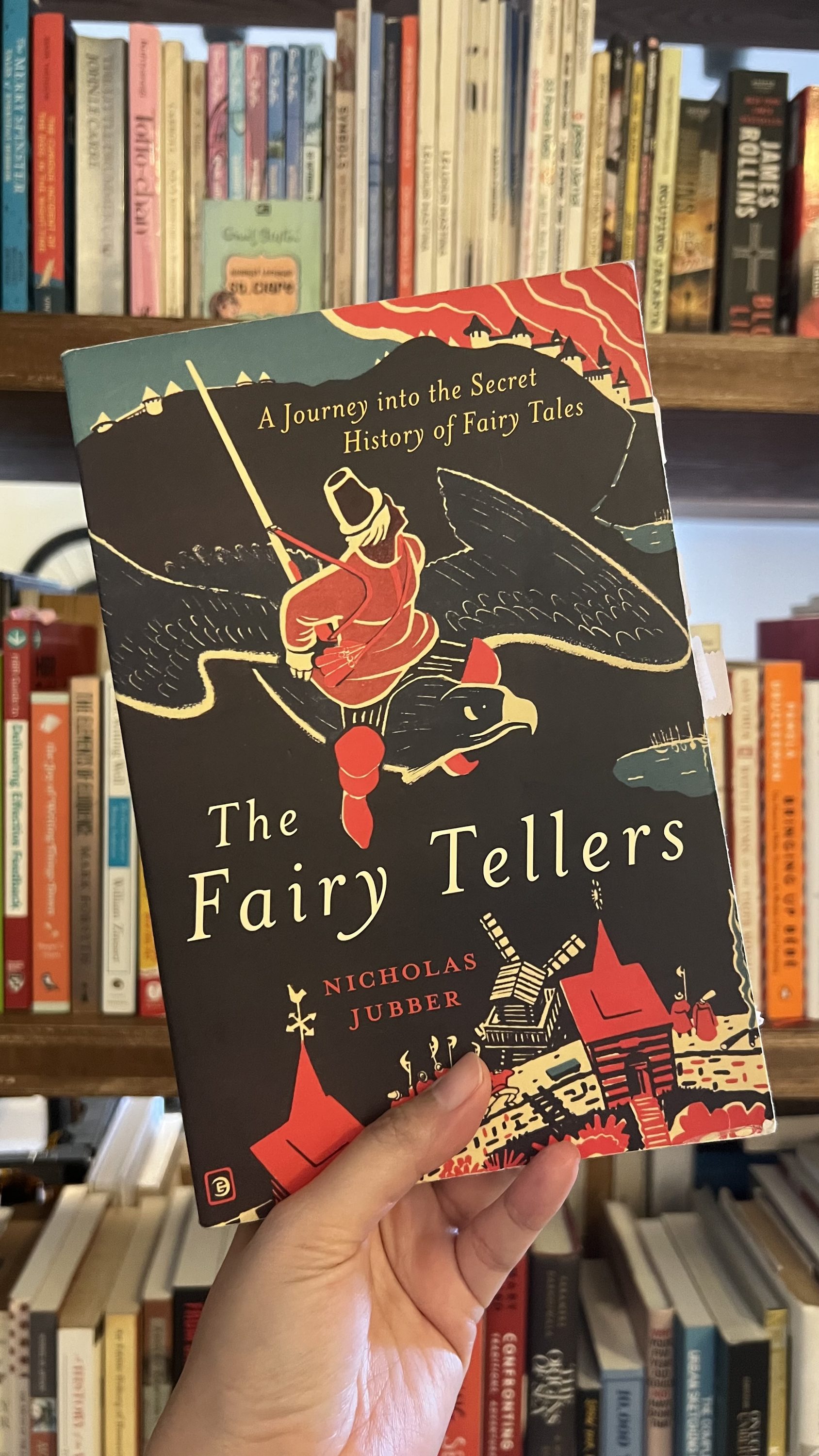
I have this habit of reading fiction and non-fiction works together. When things got too intense in one of them, I would pick up some pages from another. This book has been on my Currently Reading for quite some time, and I am yet to finish it. Now that we have finished the exhilarating world of Agatha Christie, I feel we can delve back into the world of fairies, princesses, knights, and mythical beings all over the world — and those who created such worlds: “The Fairy Tellers” by Nicholas Jubber.
I was in the kitchen, preparing for dinner, when Ari entered the kitchen and said, “There is this chef– wait, perhaps a competitor in a cooking competition. They prepared sashimi, right, and for some reason, the judges were like, ‘ Your sashimi is good, but you will need to elevate it more.’ How do you elevate a sashimi? It’s a raw and cold dish.”
I’m paraphrasing, but you know the gist.
That said, that was exactly my thought, too. I can understand if it’s beef tartare or carpaccio, but sashimi? The only thing I can think of is either you use a God-level technique (IDK, your knife skill is on par with Zoro from “One Piece”, I guess?) or catching a legendary-level tuna that people would mistake for a legendary Pokemon. Or add more wasabi? Perhaps?
Anyway! It reminds me of this book that I finished last month-ish. I was hemming and hawing on whether I should write anything about this novel on this blog, mostly because this novel is… different. It’s not a bad novel; it’s just different from what I expected in the beginning.
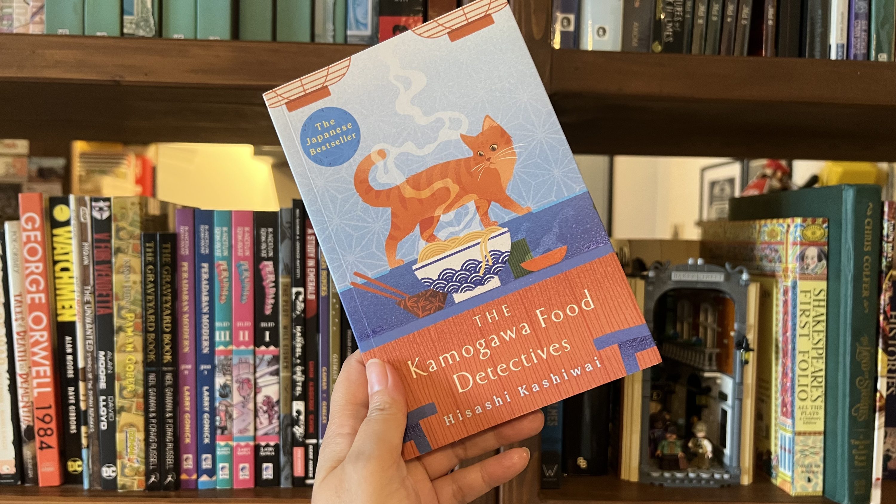
This was the novel: The Kamogawa Food Detectives by Hisashi Kashiwai.
I must preface this “review” with a disclaimer: I approached this novel with a different expectation and it does not make this novel, and anyone involved in bringing this work to the mass, should be seen as less than extraordinary.
I thought this novel was about a beat-up detective or Private Investigator working on criminal cases, and throughout their investigation process, food was one of the central elements in their daily life. Think… “The Cat who Solved Three Murders” by L T Shearer, a.k.a. Enid Blyton meets murder mysteries.
… Or Lisbeth Salander with IKEA furnitures on “The Girl with the Dragon Tattoo”. OK, too far fetched, but you get what I mean.
Apparently, the novel is about a father-and-daughter duo helping their clients unlock memories from dishes. The father, Nagare Kamogawa, was an ex-police and the chef of the Kamogawa Diner; a diner that also served as the front of the detective agency, run by Nagare’s daughter, Koishi Kamogawa. Food, as expected, plays a central role in this novel. The scene always started with the potential client entering the diner, getting curious about how quiet and unassuming the place was, trying the meal prepared by Nagare, then sharing their issue or request with Koishi at the office at the back of the diner. Then, two weeks later, the client returned to the diner, with Nagare and Koishi managed to find the dish they had been looking for.
In summary, I initially thought the novel would be a mix of “CSI: Las Vegas” with Anthony Bourdain’s “Parts Unknown” (I would blame myself for watching “CSI: Las Vegas” one episode too many), but then I got episodes of “Midnight Diner” with food research instead. No regrets, honestly.
Now. My favorite part of the novel is when the client is tasting Nagare’s dishes for the first time. I feel this is where Kashiwai-sensei is bringing out the sense of Kyoto and what this ancient town has stood for in the Japanese culinary world.
As Hideji’s gaze skipped between the various dishes, Nagare went on:
‘Stewed arame and deep-fried tofu. Okara croquettes. Kikuna leaves dressed with sesame and miso. Kurama-style sardine. Hirosu tofu bal in broth. Pork belly simmered in Kyobancha tea. Fresh tofu curd with sour plum paste. Oh, and Koishi’s rice-bran-pickled cucumbers. Nothing too extravagant. If anything, the highlights are probably the firmly cooked Goshu rice and the miso soup with ebi-imo taro. Anyway, enjoy the meal. Oh, and make sure you put a good sprinkle of sansho pepper on the soup — it’ll warm you right up.’
His eyes gleaming, Hideji nodded along to Nagare’s every word.
— Chapter 1: Nabeyaki Udon
As an Indonesian living in Malaysia, I believe the food mentioned above would look great, but it won’t hit my taste buds as strongly as I would like, simply because I’m used to spicy food, drenched with chili sauce and strong flavor. Does it make the food mentioned above less superior than the one I would eat daily? Heck, no.
On the contrary, I appreciate the simplicity of the meal explained above. This part: “… If anything, the highlights are probably the firmly cooked Goshu rice and the miso soup with ebi-imo taro.” How many people could show off plain steamed rice and miso soup as the highlight of their whole repertoire? If anything, this shows the Japanese culinary world as delicate and as as-it-is. In the Japanese culinary universe, you won’t, and don’t, need additional spices or herbs to “elevate” your dishes. Your dishes will do the talking with their main ingredient. Does it mean that the Japanese would reject spicy food or food with strong flavors? Not really, no. You might want to watch a J-drama titled “Gekikaradou” (The Way of Hot and Spicy) — and I must add that Sapporo’s curry soup is one of the best dishes in the world, but in the end, when we are talking about traditional Japanese food, in this case, sashimi, such additional spices might not be needed. Different way of preparing, perhaps. Not always in terms of adding spices or flavor extensions.
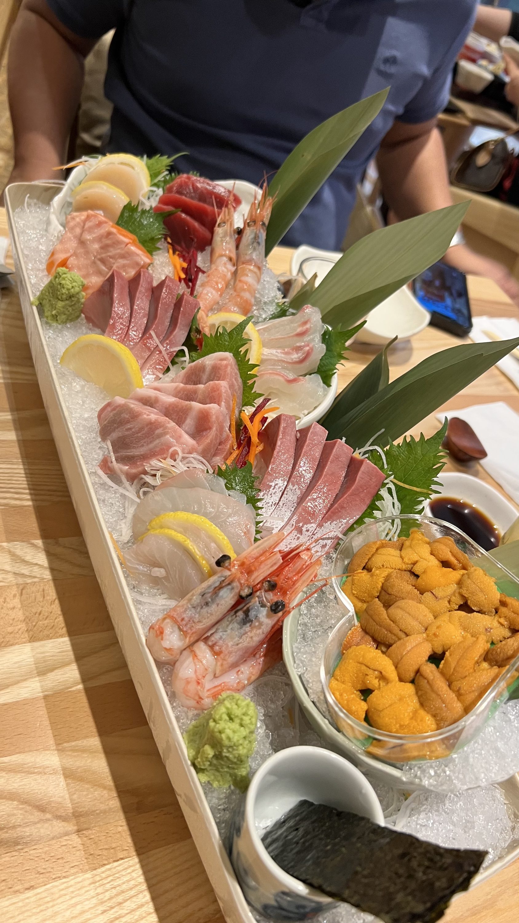
Feast your eyes upon this wonderful selection of sashimi platter, courtesy of Yuzu, Suria KLCC
Such focus on Japanese food in the novel has been so prevalent, hence my confusion when Ari mentioned that a cooking show judge said that “the sashimi could be elevated”. I know most Japanese would kick me for adding shoyu on my chawanmushi (I can’t help it! At least the shoyu would give a bit of a nice saltiness to the egg pudding), so I honestly don’t see the need to “elevate” a plate of sashimi. Sashimi, inherently, is a dish served with such respect for quality and skill, and I honestly believe that the only way to elevate a plate of sashimi is by having it directly at the fish market with a cup of ocha in the wee hours in the morning, just as the fish market opens.
While we are on the topic of this novel, I also want to highlight the… subtlety in this work. If you are familiar with the Japanese’s concept of honne and tatemae, you might able to pick them up once or twice throughout this book, hahah. My favorite:
‘What kind of food do you serve?’ asked Suyako, eyeing the ramen bowl that had been left on the counter, in which a small pool of broth remained. ‘I’m afraid I’m a little fussy.’
…
‘Well, if you’re happy with something light, I can serve you right away.’
‘That’d be just fine. I eat like a bird,’ said Suyako, a relieved look on her face.
…
‘Apologies for the wait,’ said Nagare, arriving with the food. ‘I’ve prepared a selection of light dishes.’ He began removing a series of small plates from the round tray he was carrying and positioning them in front of Suyako.
‘From top left,’ began Nagare, tucking the tray under his arm, ‘Miyajima oysters, simmered Kurama style, miso-glazed baked butterburs with millet cake, bracken and bamboo shoot stew, chargrilled moroko, breast of Kyoto-reared chicken with a wasabi dressing, and vinegared Wakasa mackerel wrapped in pickled Shogoin turnip. In the bottom right you have a hamaguri clam broth thickened with kudzu starch. … Today’s rice is from the Koshihikari variety, sourced from Tamba.’
…
Once Nagare was out of sight, Suyako took the Kurama-style simmered oyster and placed it on top of her rice, then poured some tea over the bowl and began bolting it down. With the occasional paise to sample the wasabi-dressed chicken breast, she emptied the bowl entirely, right down to the last grain of rice.
‘More rice?’ asked Nagare, who had emerged from the kitchen again and was extending his round tray in her direction.
— Chapter 4: Tonkatsu
I love how Kashiwai-sensei presented a contrast in such a fleeting way with several paragraphs. We see the character Suyako, trying to show how delicate she is by saying, “I’m a little fussy” and “I eat like a bird”, but ended up clearing down a whole traditional set menu. If you are familiar with Japanese dishes, you would know that a Japanese regular set menu meal is… a lot. It usually looked like this at minimum:
While it can also be seen that it could be mean Nagare’s cooking skill is really good since Suyako, who might rarely eat heartily, managed to finish the whole set meal, it shows how most Japanese are expected to behave and say things in a certain way to uphold their image, yet when being face to face with a delicious meal, one would not be able to resist.
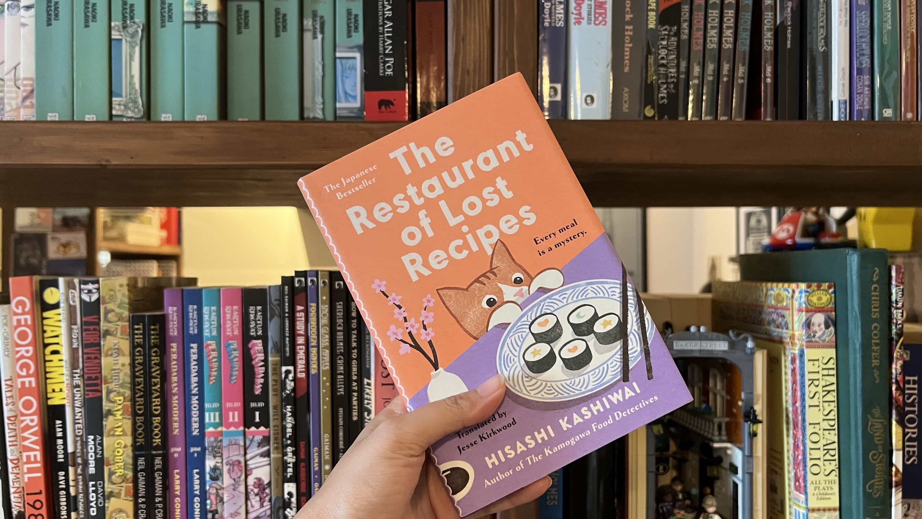
As a whole, this novel is interesting in the sense that this specific genre, cozy mystery, is a new area for me. I do have favorites, though! Nita Prose’s works are some of my favorites (I know I have written about “The Maid”, and I am yet to write about “The Mystery Guest” and “The Mistletoe Mystery”. I promise I will do that. Sometime later. Ish) and Hisashi Kashiwai’s works would be a great additional on the book shelves. As a matter of fact, I have another one here: The Restaurant of Lost Recipes.
Yes, I know. Will read it. Will write about it. All that jazz. Yes.
I have been plagued by this memory of a beauty YouTuber, short hair dyed red, with stacked eyeshadow pots. This YouTuber was one of my go-tos whenever I’m looking for a makeup tutorial, and while I had some of her videos saved on a playlist, I found out that she set her older videos to “Unlisted”, hence the missing videos from my playlist. I have been racking my brain trying to remember who she was for months, until I found her name mentioned in a several-year-old Reddit post last night.
Let me reintroduce to you: xsparkage, a.k.a. Leesha.
Rewatching her videos gave me such a trip down the memory lane, on how and why I love the Beauty YouTube environment at that time, despite all the drama and the mess in the year following. It has always been so genuine and less filtered. It was amateur, messy, grainy, not poreless, unprofessional, bad lighting, not forced by an algorithm, and genuine. It felt like sitting with your friend in the room doing makeup. The biggest irony? Their skin is not perfect, but these beauty YouTuber putting their face front and center, put it on the camera as close as possible because goddamnit the viewers have the right to see how they make that perfect back-to-school look. They need to know the techniques! That “come what may”-mentality, unfear of being called “cringy”.
I also noticed something important from these old videos: You can see when the YouTuber is genuinely liking the product. They will genuinely rave about it as iwantedbethany put it succinctly:
No, you won’t see PR packages. Instead, you would see makeup pots or pans hit the bottom or messy, un-aesthetic eyeshadow palettes. The tools of the trade showed love and constant usage. You won’t see any self-respecting YouTuber swiping a color on their face and going, “oh ✨ goooshhh ✨” or making the jaw-dropped expression. You would, however, hear them mumbling along the lines of, “– I really like this palette, love the color,” or “I love these things. I got them suuuper cheap at drugstores, and I feel like they hold their colors really well,” while applying the said product.
I know some beauty YouTuber nowadays would scream and make a cross when they see this. Showing a “not new” product? Oh noes!
Even if there were PR packages back then, it was rare for the YouTuber to go, “sooo, a lot of you guys have been asking me to do makeup of brand XYZ” (no, we did not) or “I love how this product is doing wonders on my skin! You can see that it makes my skin looks glowy and glassy!” then proceeded to take out a brand new, hermetically sealed skincare product from a box. Like, yeah, okay. Cool.
Swatches? It was a guerrilla strategy between the YouTuber/blogger and exasperated salespeople. Karen from Makeup & Beauty Blog had to do duck-and-cover just to get swatches and pictures for MAC Fafi: MAC Fafi: The Things I Do For Love.
Now, would I go back to those grainy, 16MB-quality pictures and videos, where we can’t see the products properly? No. We do have great names in this decade, such as Lisa Eldridge and Erin Parsons. They have even gone beyond beauty tutorials, sharing their passion for the industry and its history. What I genuinely feel we do need is the humane aspect of it. Not an ultra-polished poreless filter, 1.5x speed with overlapping narrations using AI-generated script (UGHHH!), hyperbolic reactions/expressions, and loud background music. Bring back my girl friends dammit.
I can’t wait until we no longer have freaking algorithms in our timelines so people could just, you know, make things.
This is my personal blog, so anything goes. This blog has been around since 2014, which means you would, and could, see my past writings with different perspectives and mindsets at that time. While I tried to tidy things up here, I personally feel that things should not be too “clean” or polished. You see me grow and learn in this blog. This blog is a record-keeping of what I was, what I am, and what I will be. What I wrote in the past might not reflect who I am right now, nor me revisiting the topic.
While things here are generally PG-13, I must remind you that I’m an adult, which means some topics might be too heavy for younger readers.
I want to develop themes that sing praises for the 2000s. I always feel we could have a bit more 2000s-era whimsy.
the blogger
Nindya. Kapkap. she/her. Indonesian in Malaysia. Millennial. Lo-fi. Post-Rock. Gregorian. Animal Crossing: New Horizons. Murder mystery genre. “Love is Love“.