I have been busying myself with bloghopping and checking out blogging communities/webrings for the past week, thanks to the renewed sense of excitement in blogging after checking some blogs on Neocities, and I found this one particular community: IndieWeb.
I was initially skeptical about myself joining the community, mostly because, from where I come from, joining a community means that you need to be invited first. Having oneself show up on the front door and say, “Hi! Your community looks cool. I want to join!” is kiiiinda an alien concept for me; hence, when I checked the Getting Started guide, it took me a good couple of days to question myself, “… this is it? You only need to create a website or a blog, then join the chat channel? And if it’s possible, attend events and meet the folks?” Again: “Hi! Your community looks cool! I want to join!”
That said, after so many hours of questioning and doubting myself (“it can’t be this easy, right? Are they that welcoming?” Answer: Yes, yes, they are) I joined the Discord channel and introduced myself. I am now part of the community!
I am still reading the guides and the articles on the IndieWeb website to familiarize myself, and it has been fun. I also found this, though:
Share what you did / discovered in the process of building your IndieWeb site, even if it is only a single page, with a simple design.
Aaaand, I just realized I never really talked about how I made/designed this site. It seems like I have been taking things for granted (“I knew about this, so do everyone else!”), and if I want to have other folks have the same excitement in personal blogs and website like I do, I feel it should be fair if I share how I do things, and hopefully, it can help others who want to approach their site with their own style and design!
I am not going to talk a lot about setting up a website with WordPress, mostly because you can find a better guide (and courses!) by the WP community themselves here: Start using WordPress. Now, I want to share with you on how I designed this website. I also put some kind of “table of contents” here just to make it easier to navigate:
Basic theme
The theme that I’m using is Twenty Twenty-Four (TT4). I always have a soft spot for the Twenty-theme series, mostly because the Twenty series are the ones that showcase the main version of WordPress at that time and what it can do. I chose TT4 because it serves as the blank canvas for me (fun fact: Does anyone remember the theme Blank Canvas by WordPress/Automattic several years ago?)
“Why not using the theme Twenty Twenty-Five?”
I’m… not sure. For some reason, I feel more connected to TT4, hahah.
The homepage: Display your blog post and the sidebar
For posterity, I will be using screenshots from my other blog (a free website/blog on WordPress.com) to provide you with some visual guides and some screenshots from this blog. You will notice the changes, so I hope it won’t be too confusing and still helpful nonetheless!
The theme TT4 is using the template Blog Home to display the homepage instead of Index. I honestly don’t know why this theme is using the template Blog Home as the homepage (in the old days, themes usually using the template Index when displaying a static homepage, but yeah, with Block Themes, such lines became blurry.) First thing first, install and then activate the theme, then go to the Site Editor (WP Admin > Appearance > Editor)
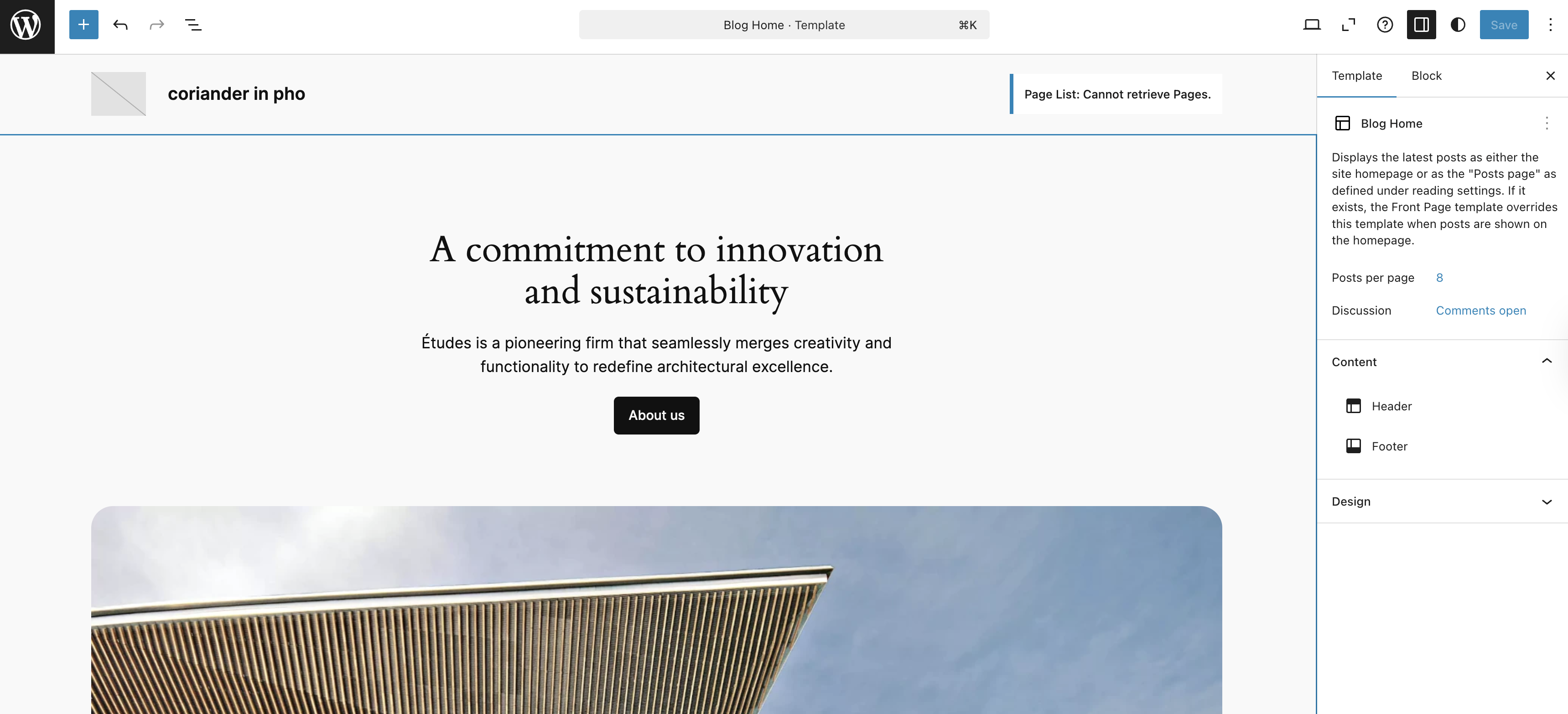
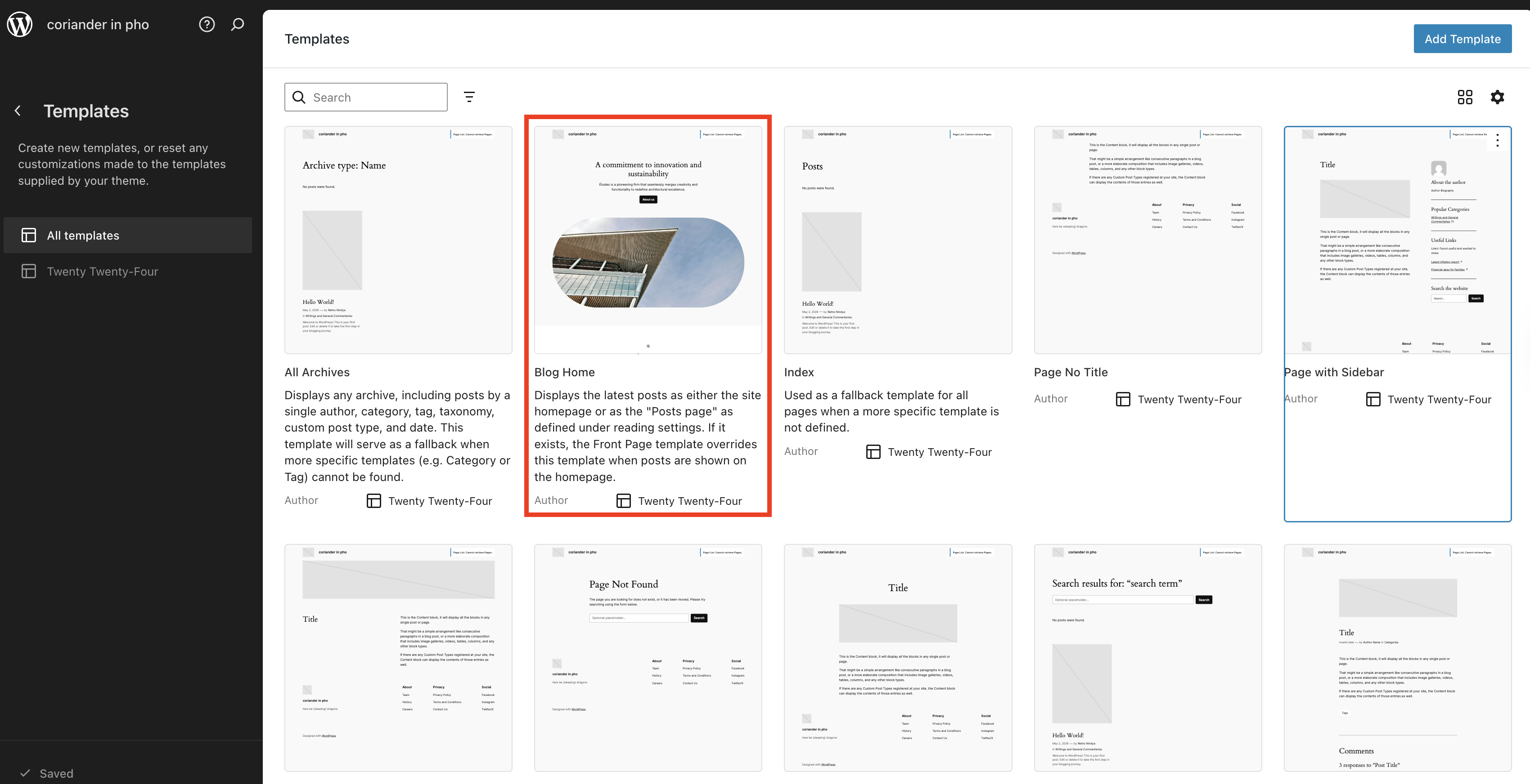
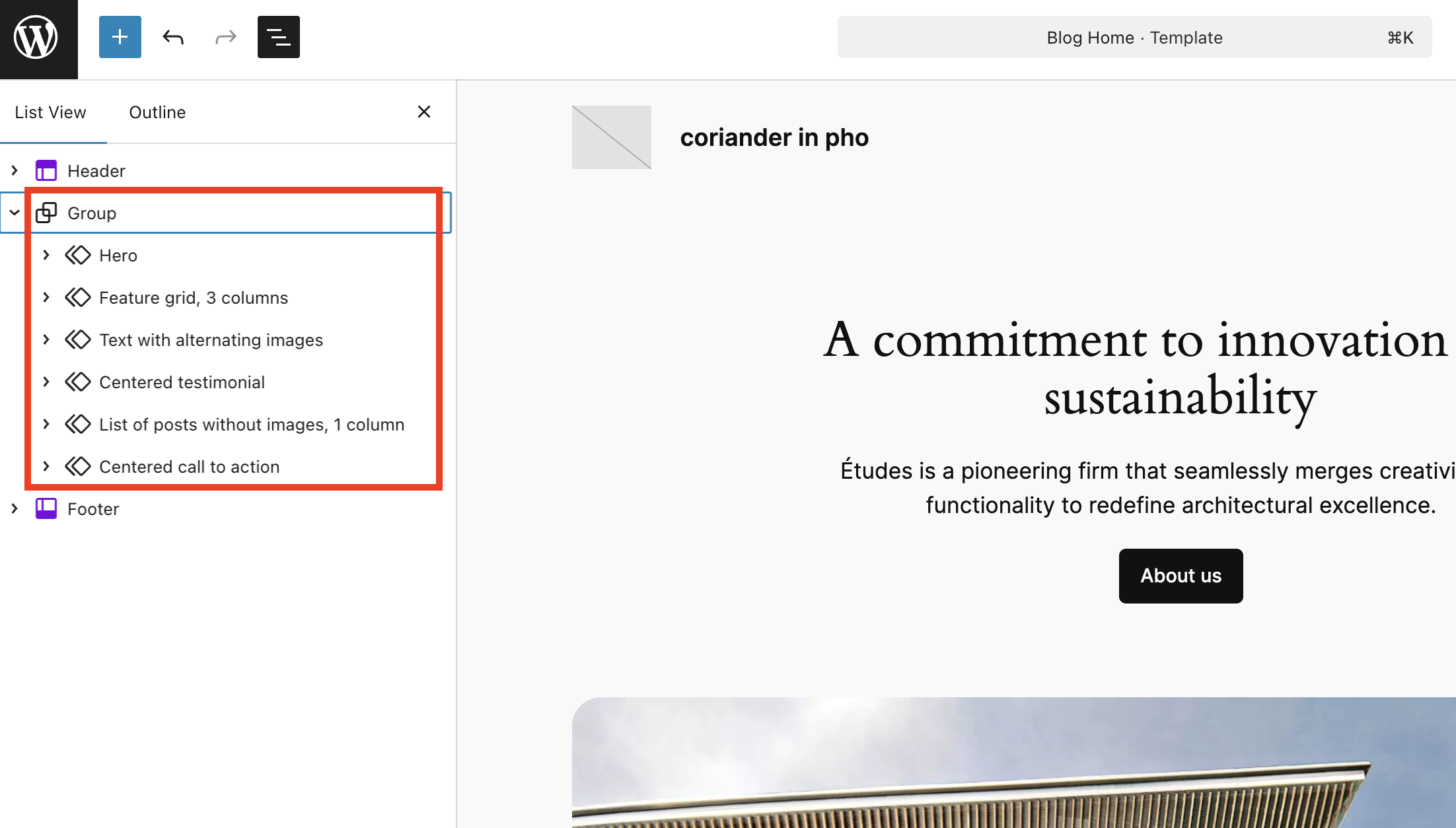
Now, when you see the template Blog Home, you will see the main content area under a Group Block. Since my goal is to have a blog-looking design with a sidebar, I deleted the whole thing except the Header and Footer sections.
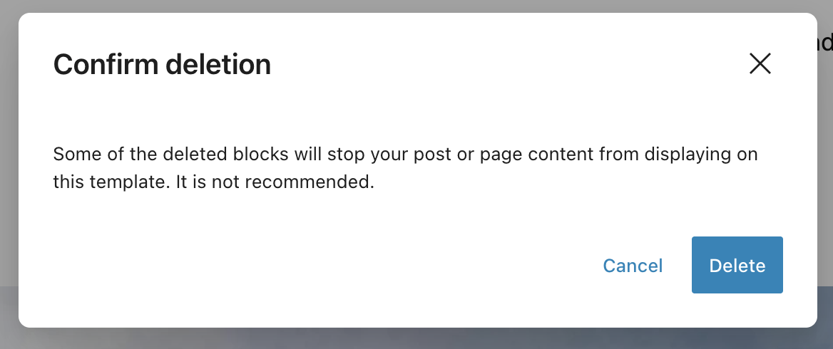
When you click the “Delete” option, you will see this scary-sounding notification pop-up. I clicked “Delete” to continue (don’t worry, we will bring them back in the design we actually wanted!) Basically, this warning appears because it has been historically recorded that some users deleted the Content Block and got confused why their website content had gone missing (I was there when All The Questions Pouring In), hence, the developer team decided to put out that notification.
Then, I brought back the Group Block. I clicked Enter, which created a new Paragraph Block (don’t worry, this is normal and expected), then I typed “/group” to add a new Group Block.
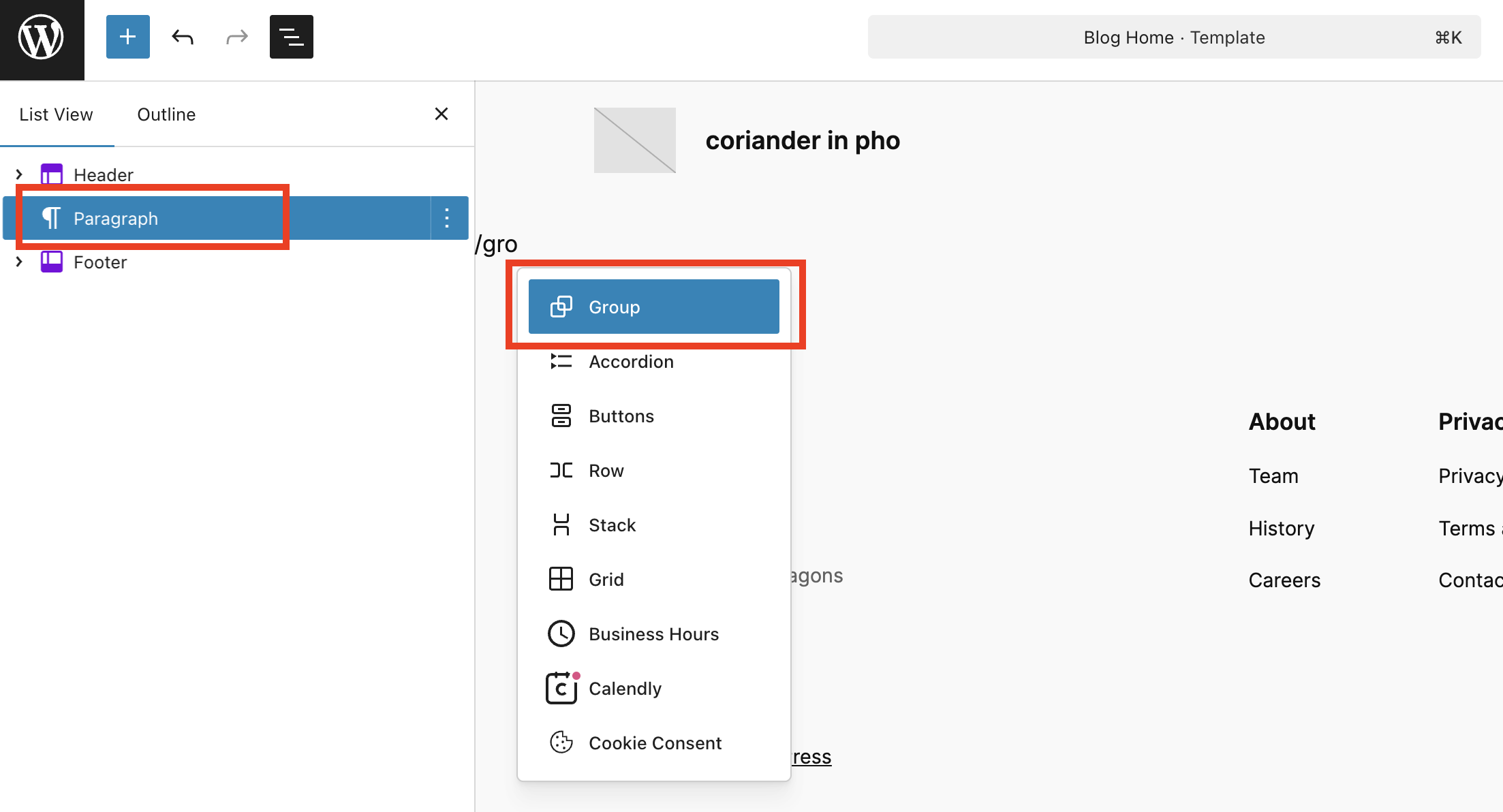
I chose the regular Group Block instead of Row Block or Stack Block.
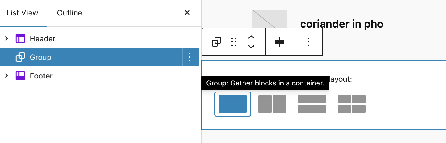
Then, I inserted the Columns Block inside the Group Block. This is the basis of our blog post and sidebar.
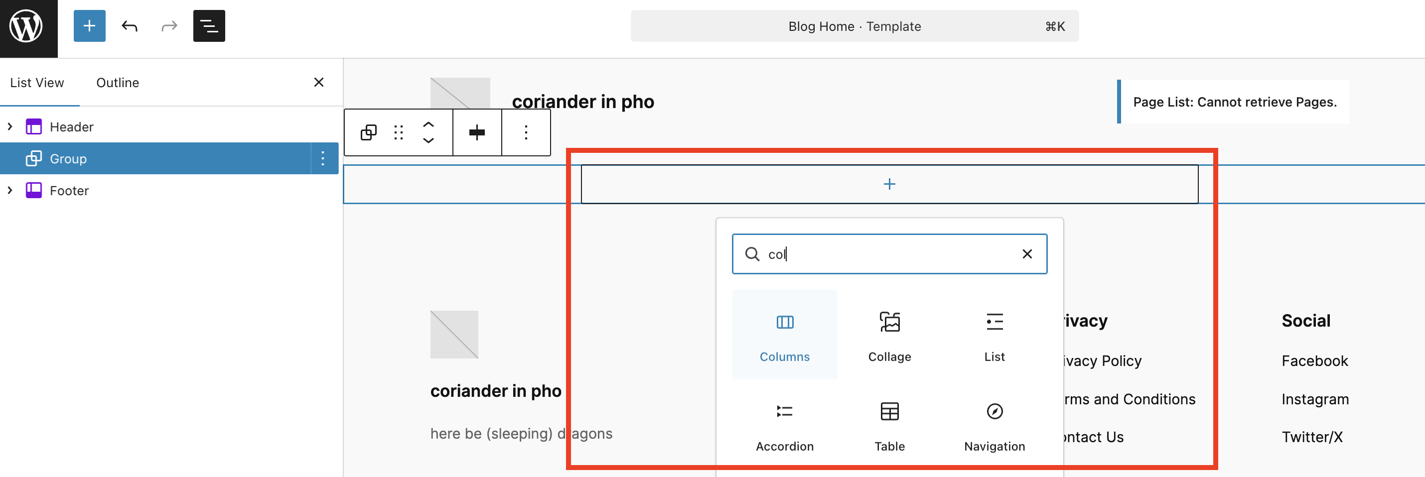
I chose the 66-33 because I wanted to set the blog posts section on the left side. This means that the left column’s width is 66% and the right column’s width is 33%. Not to worry, you can always change the value any time and to any number you fancy.
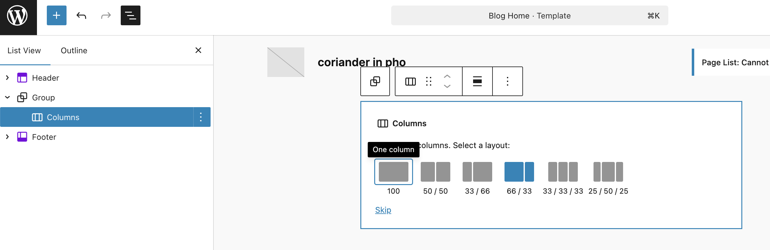
On the List View, you should see this. Header template, followed by a Group Block, and inside it, a Columns Block with two Column Blocks (left and right), then the Footer template.
Fun fact: I LOVE using List View, because it helped me choose the block that I want easily without fumbling with the other blocks. Really helpful when you have parent-child blocks like the ones I’m showing you here.
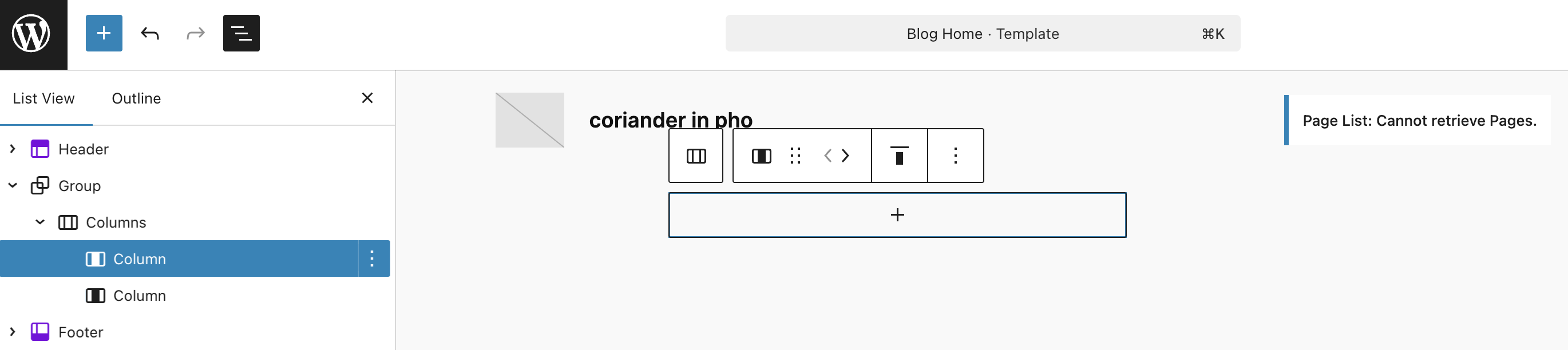
Display your blog post!
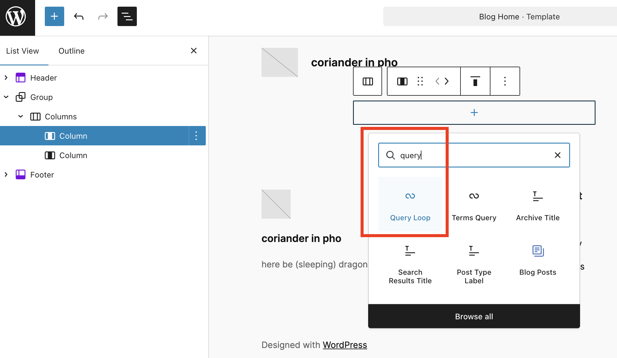
Then, this is where the magic happens. On the left Column Block, add a block by clicking the + sign, then choose the Query Loop Block.
Intermezzo!
“What is Query Loop Block?”
Query Loop is the system on WordPress to display your posts, previously known as “The Loop“. As mentioned on the Codex: “… Using The Loop, WordPress processes each post to be displayed on the current page, and formats it according to how it matches specified criteria within The Loop tags.” Query Loop Block is the no-code method of adding The Loop without users fumbling with PHP codes, and they can adjust the display (e.g. display the timestamp, dates, etc) with WYSIWYG UX/editor.
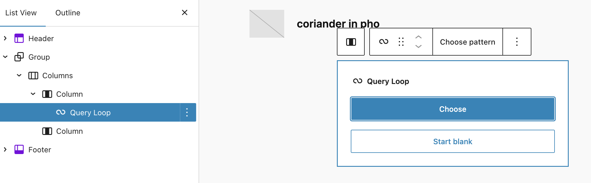
Then, you will be opted to choose whether you want to use a pre-existing template/pattern or if you want to start from blank. I chose “Choose pattern” (because I’m lazy, and once upon a time, when the Query Loop Block was freshly introduced, I tinkered with it up to a point I broke it on my test site so I got traumatized and went “HELL NOPE I RATHER JUST USE PREMADE PATTERN THANKS.”)
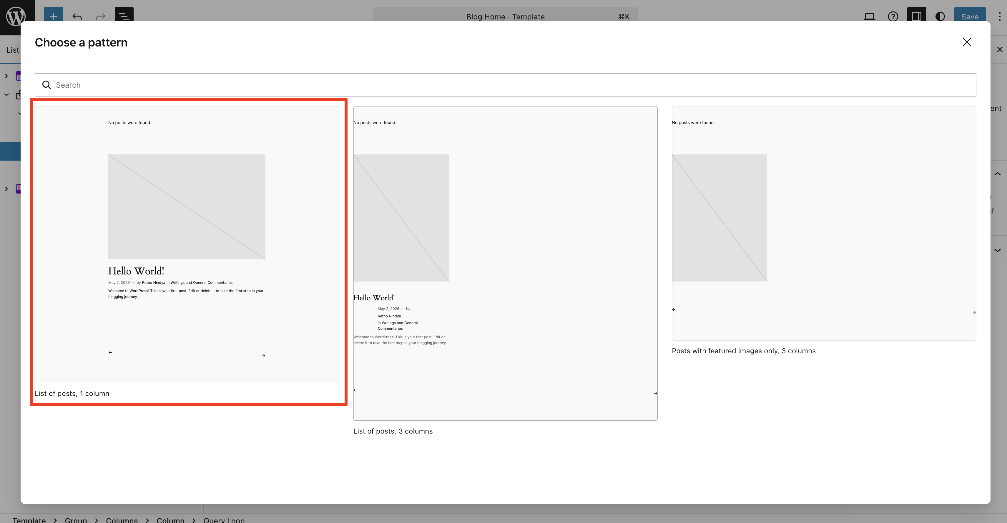
Since the goal is to display blog posts in a conventional way (one column, vertical, no grid), I chose the first option (“Lists of post, 1 column”).
Ta-daaaaa! 🎉
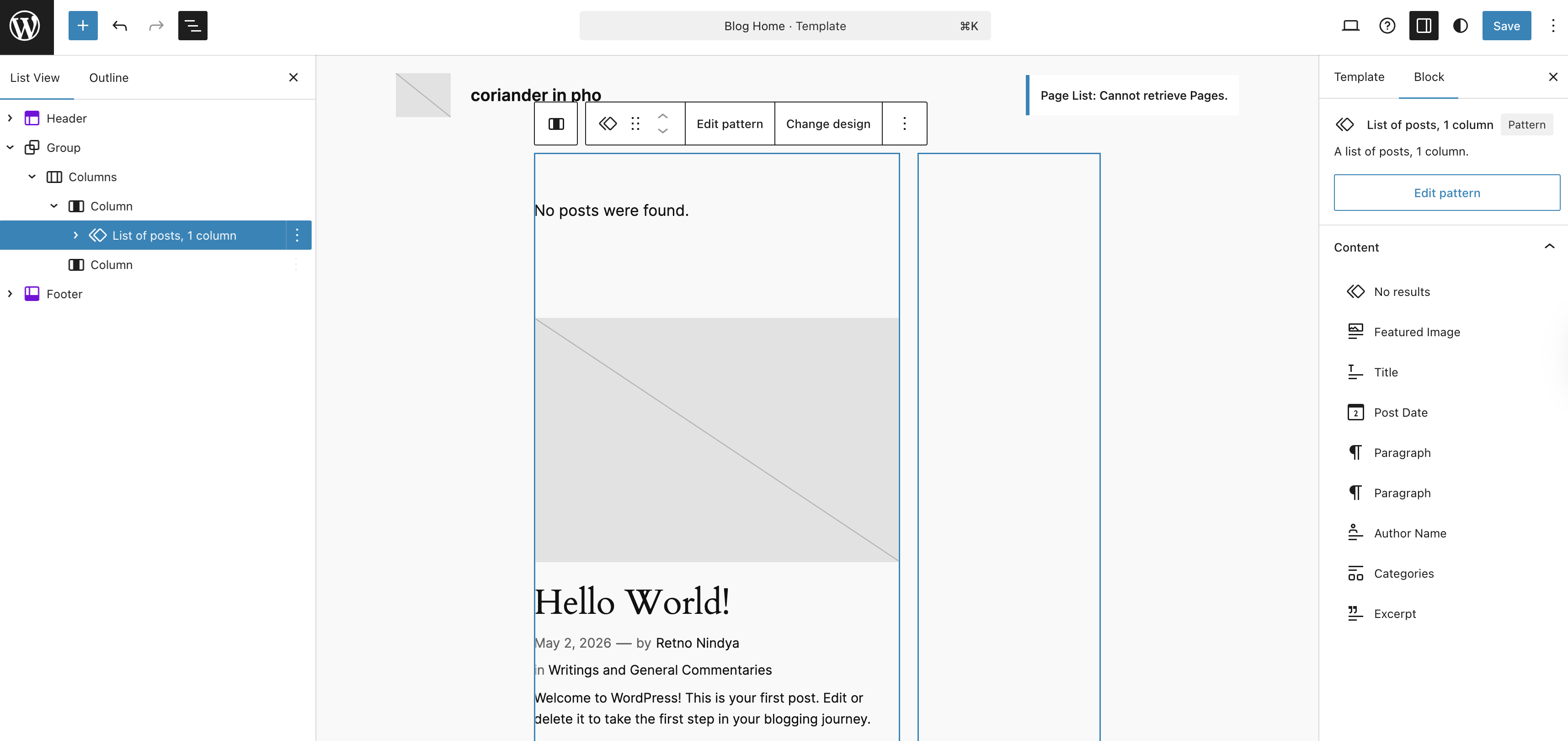
At this point, you are all set, but if you are like me who are a bit finicky of display, you can edit the pattern by clicking the “Edit pattern” on the toolbar with “List of posts, 1 column” pattern chosen.
This is where things can get… Interesting. Instead of using “Query Loop Block” as the naming on the List View, the developers are using the name of the pattern to replace the name Query Loop Block. I’m not sure why, perhaps to make it easier to differentiate. That said, just to make it easier to remember: Click the two diamonds-thingy, then click “Edit pattern”.
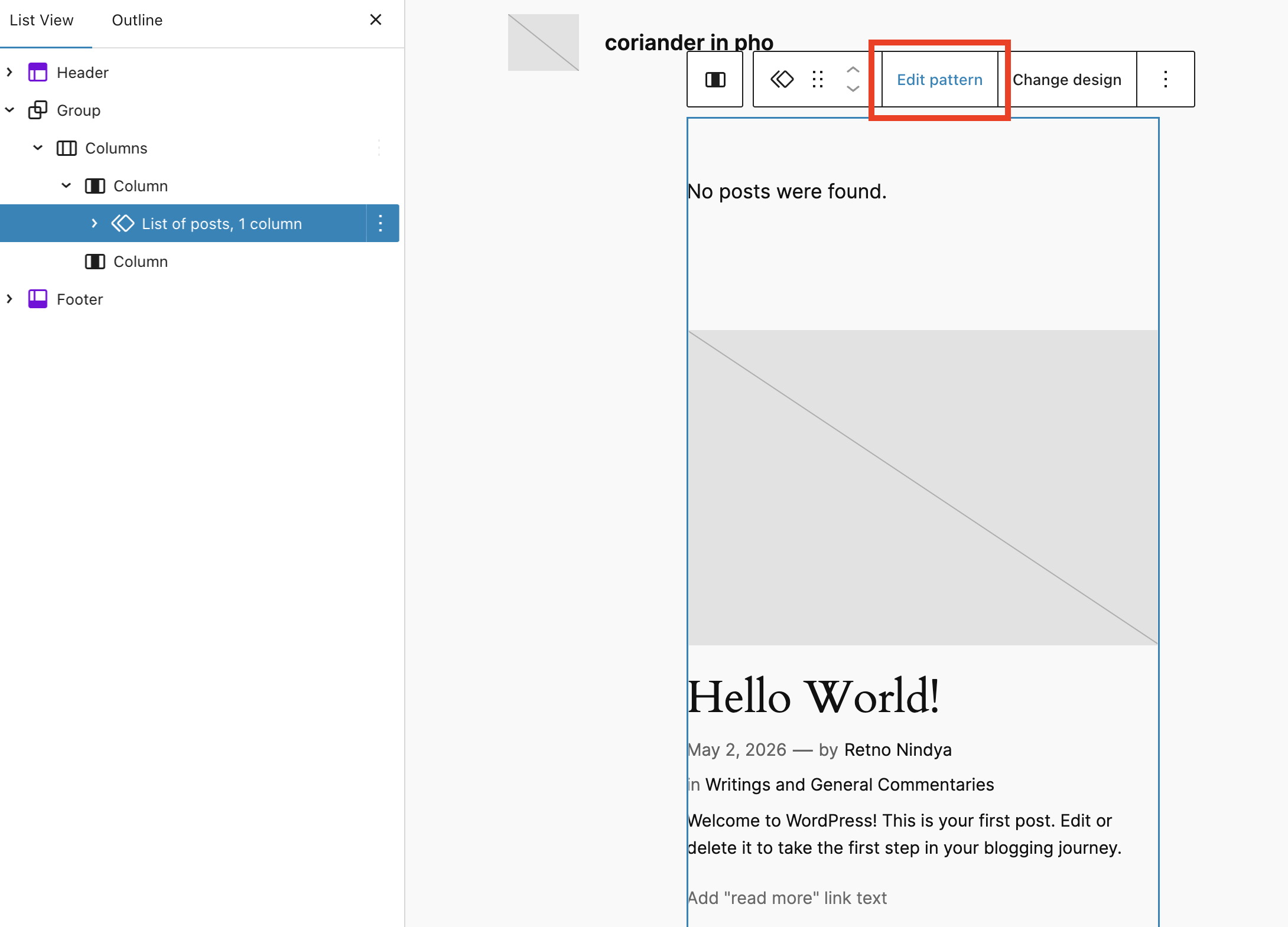
Once you clicked the “Edit pattern”, you will see the blocks inside the Query Loop Block which you can edit to your heart’s content. For your post, click the “Post Template”.
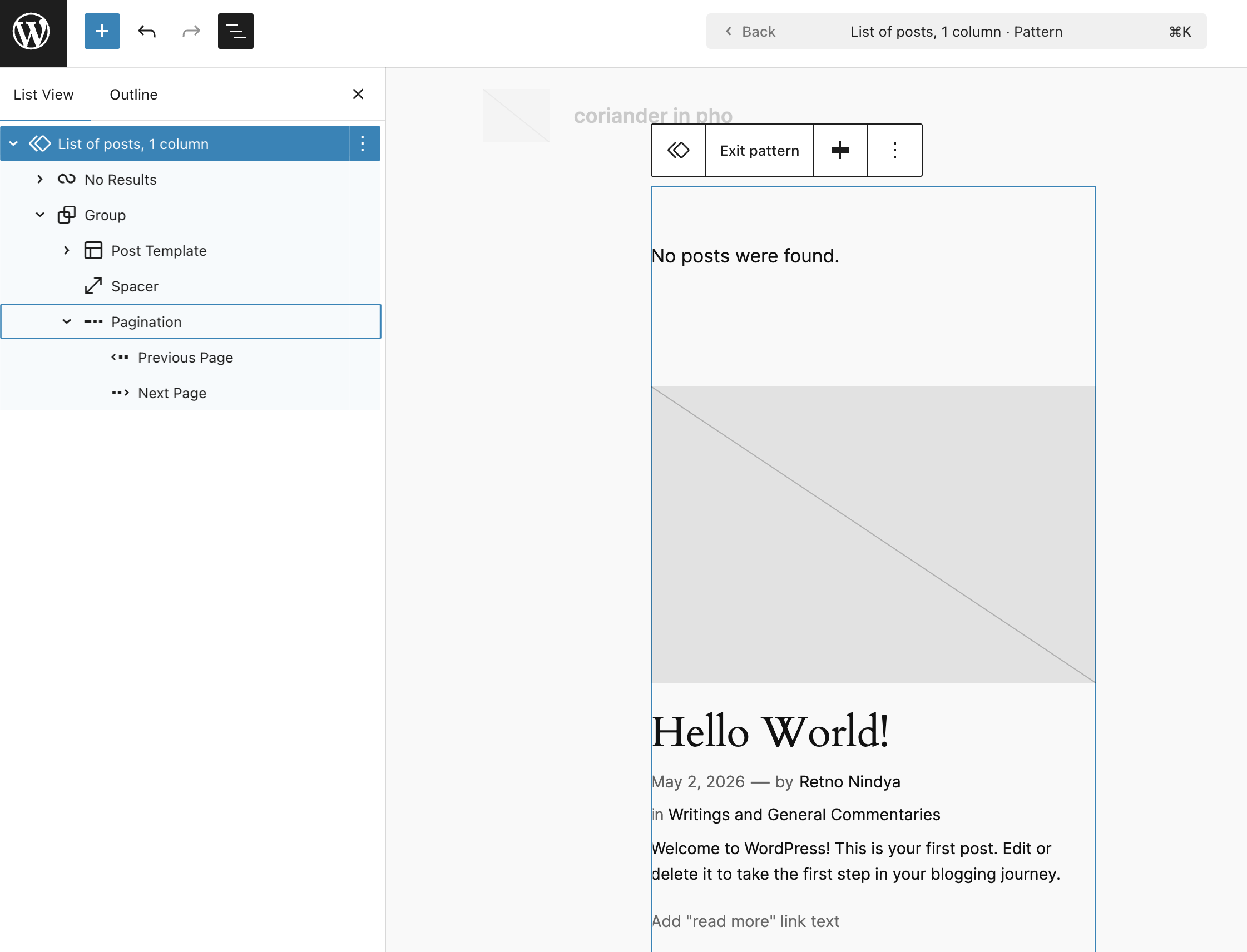
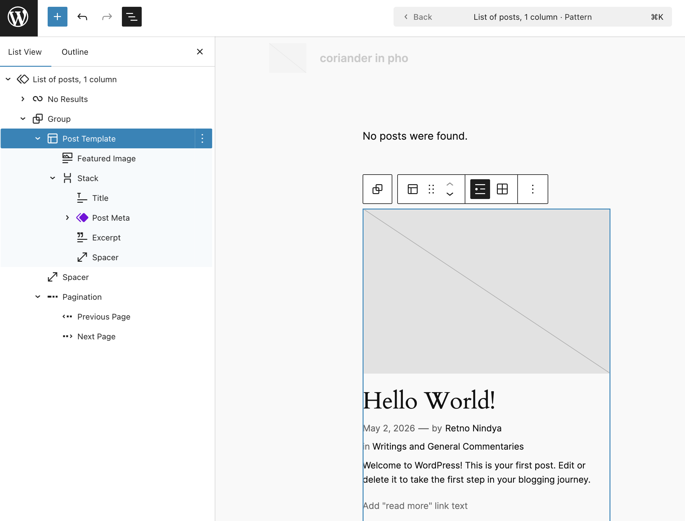
Under “Post Template”, you can adjust the display. You can remove or add blocks that you wanted. In my case, I removed the Featured Image Block and the Excerpt Block. I replaced the Excerpt Block with the Content Block because my goal is to display the whole post on the front page. This is how it looks like on my blog.
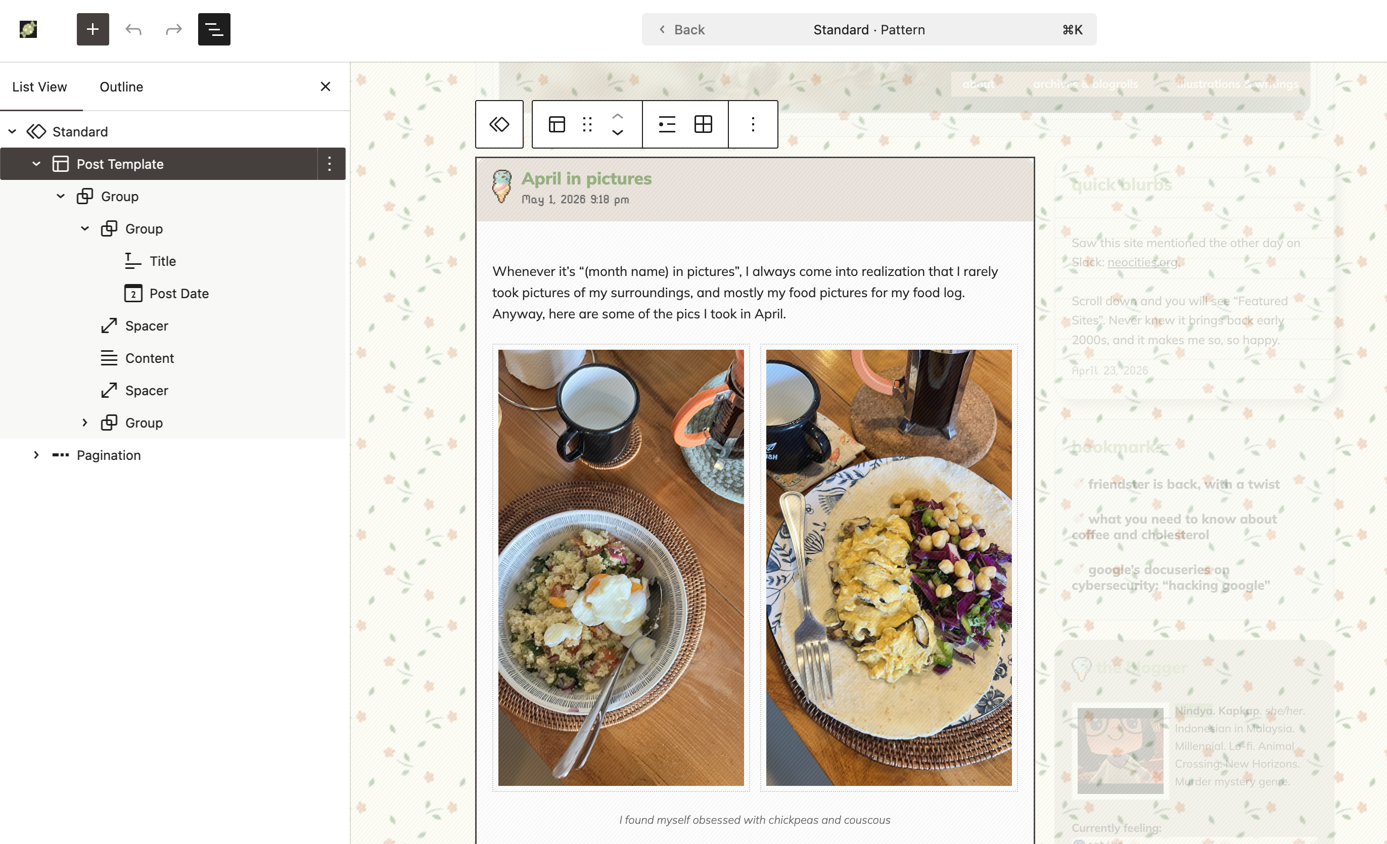
On my blog, I then do the most important step: I set the Query Loop Block (under the name “Standard”. This naming system will be different, depending which pattern you are using when you added Query Loop Block) to exclude the category Aside and Bookmarks. My goal is to have the “microblogging” and bookmarking aspect on the website without using third-party services, so essentially, I am doing the One for All on my blog. Yes, this will look weird on feed reader, but heck this is so pretteeeeeh. Posts with the category Aside and Bookmarks will be displayed on the sidebar.
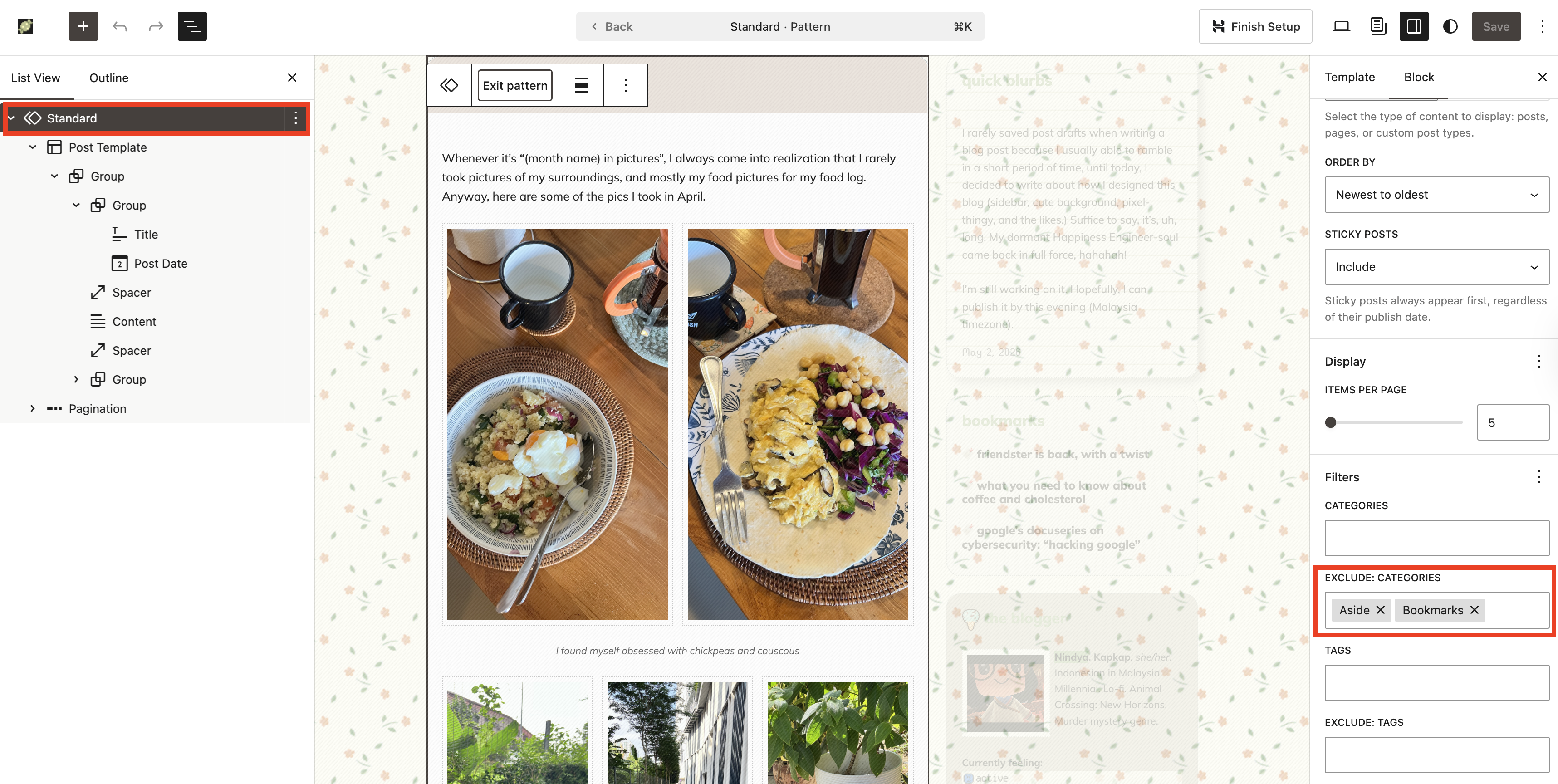
I highly recommend that you give it a try and play around with it! Once you finished editing the Post Template, you can click anywhere outside that pattern/area, or click “Exit pattern” on the right sidebar.
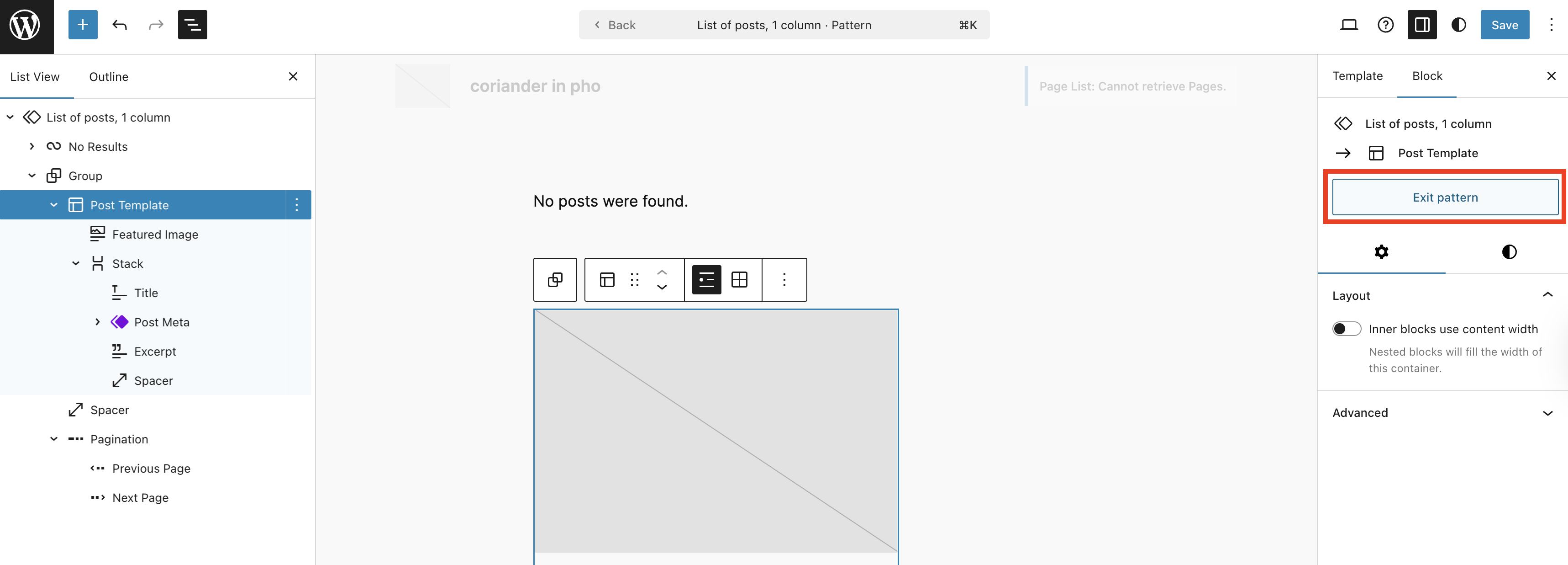
Next…
Design your sidebar!
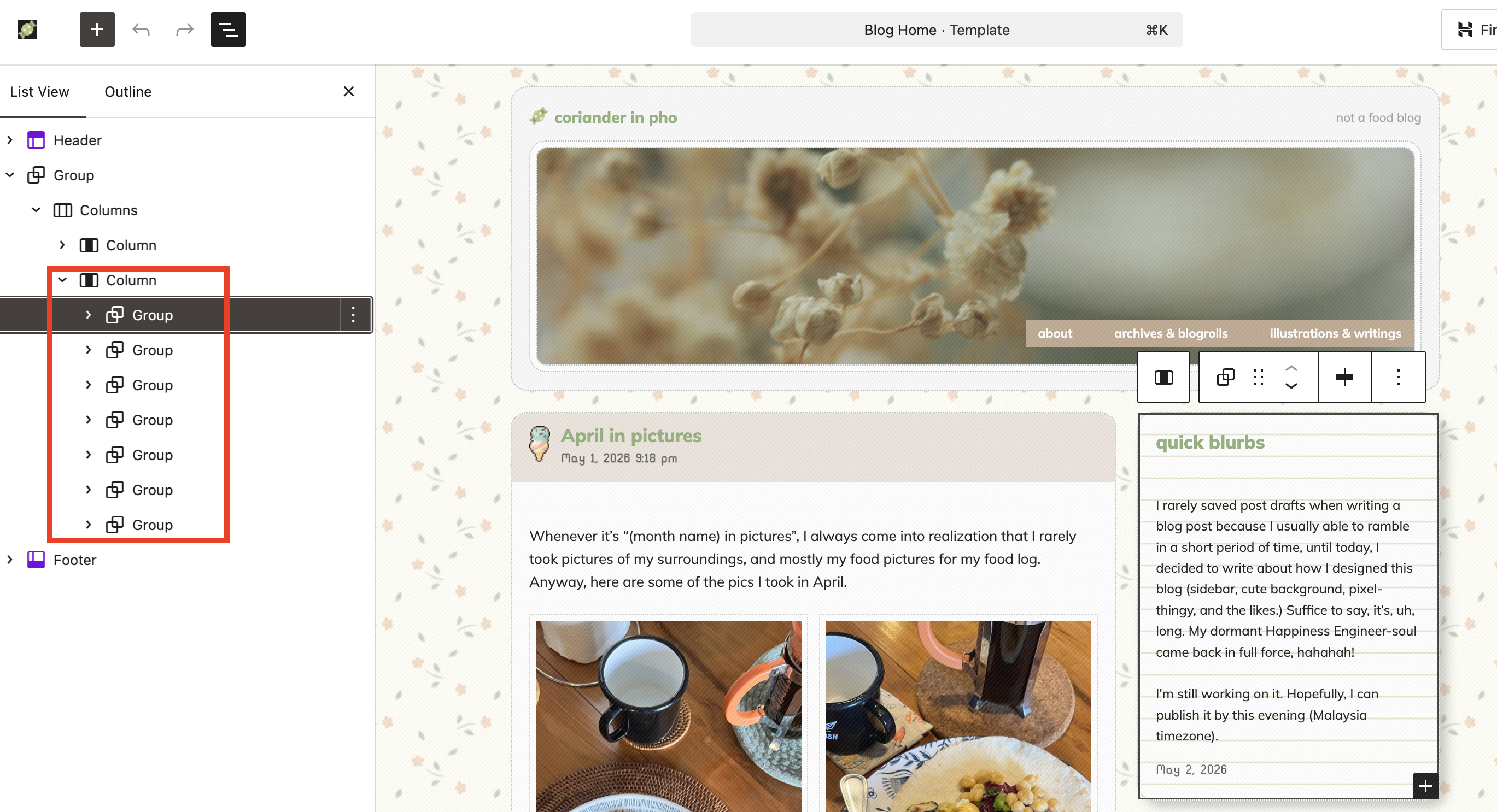
This is the fun part, because thanks to the updated Query Loop Block, we are now able to display posts from specific taxonomies (categories, tags, author, etc.) In my site, there are four sections on the sidebar that using the Query Loop Block: Quick blurbs, Bookmarks, Photoblogs, Reading, and Current Tunes. Each section is within a Group Block to keep it neat and visually aesthetics.
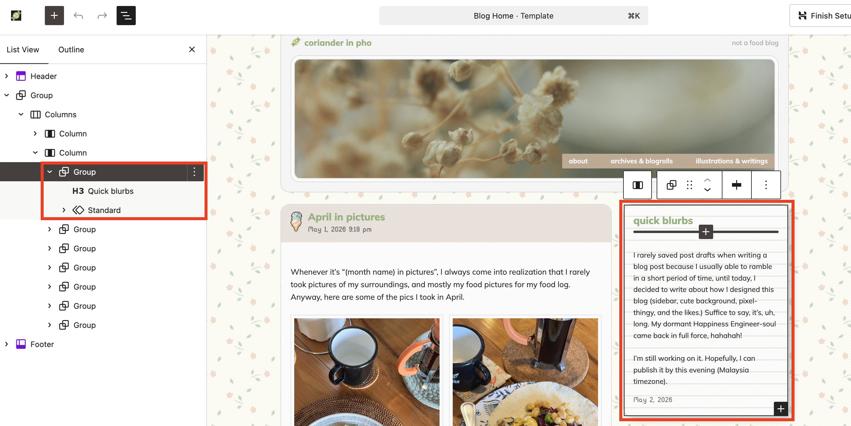
And, under the Standard pattern, you will see the inside of the Quick Blurbs section (remember the “Edit pattern” button?)
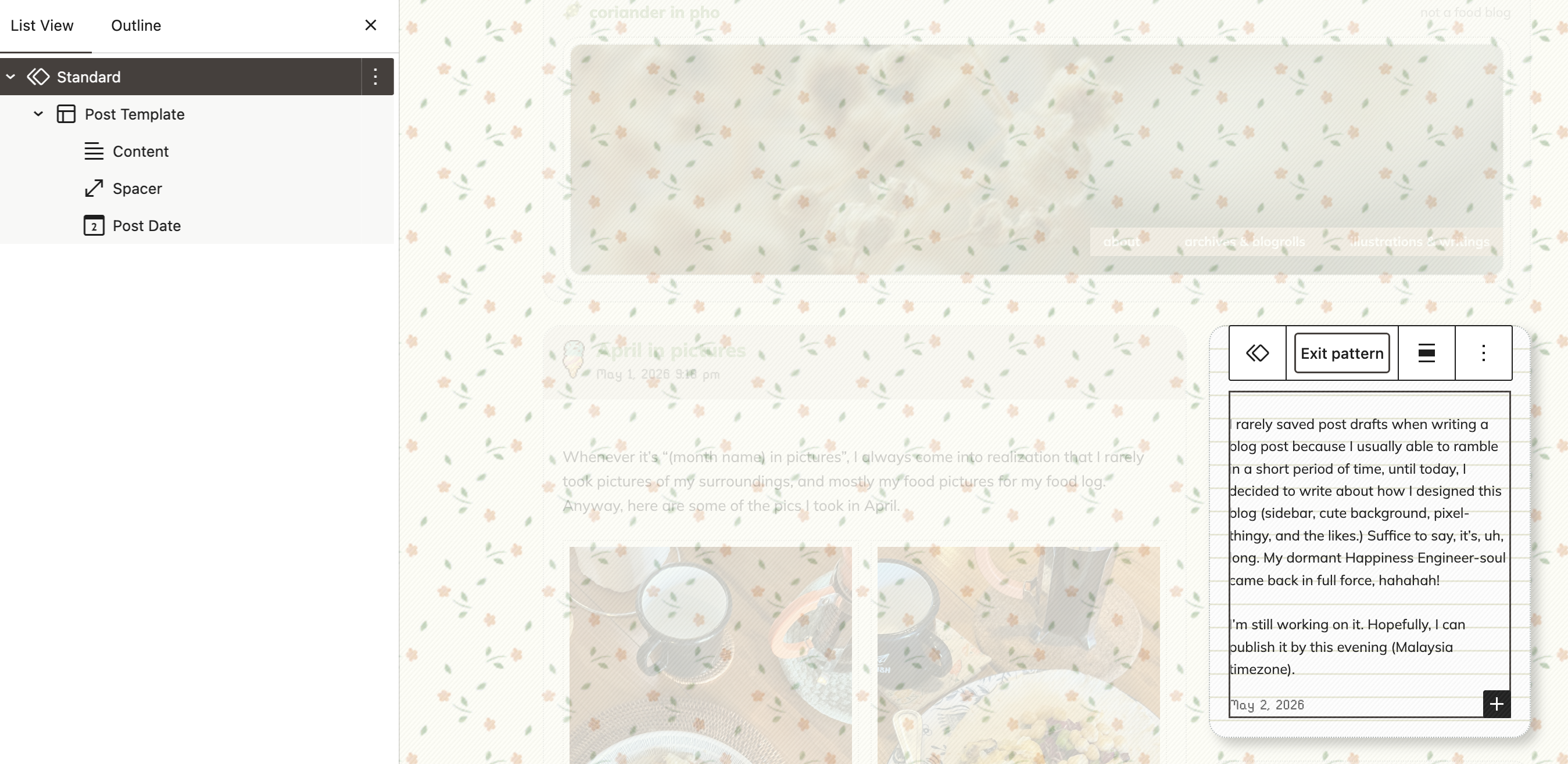
For “Quick blurbs”, I set the Standard pattern (this is the Query Loop Block, named to “Standard”/Standard pattern) to display the posts with the category Aside only. The same goes for the Bookmarks section.
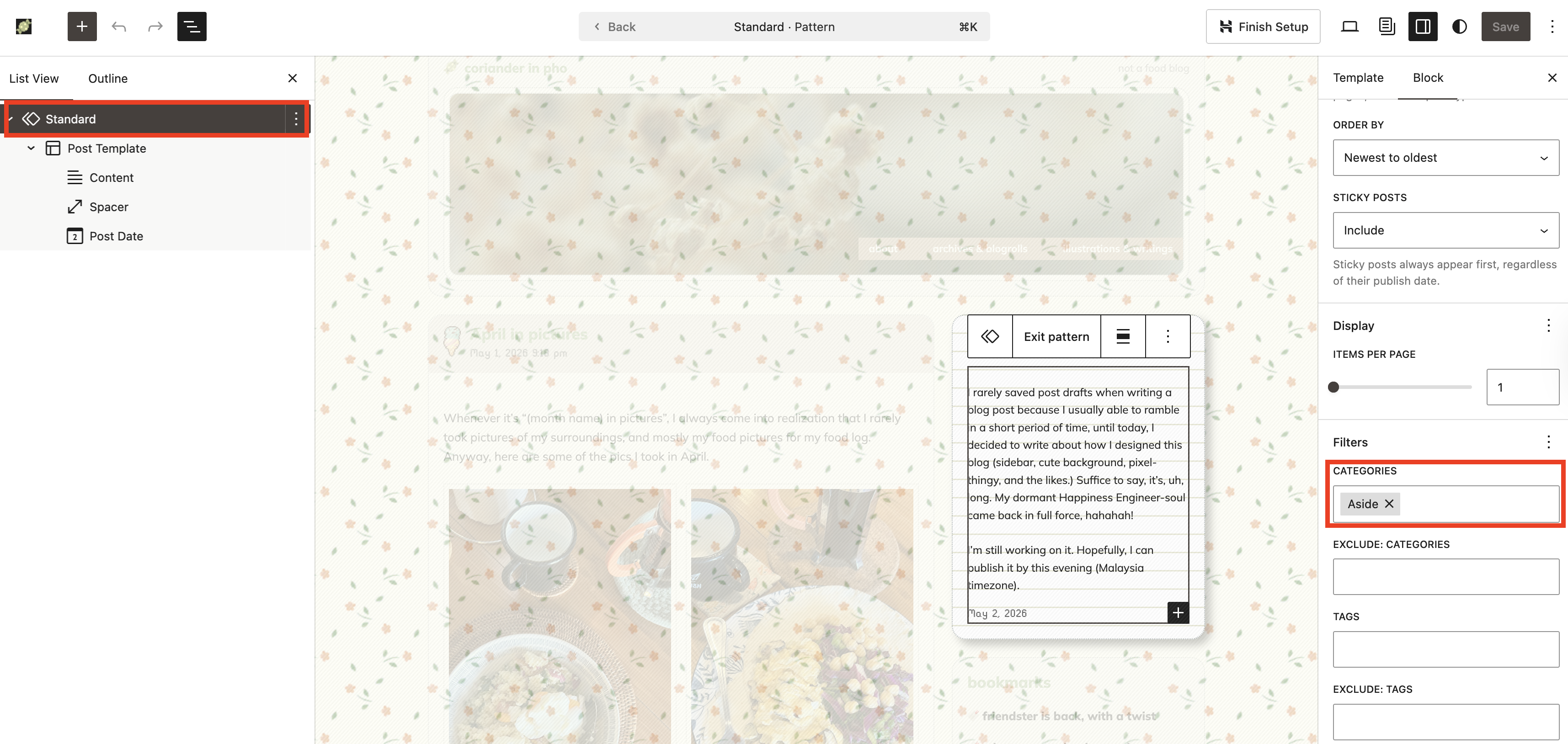
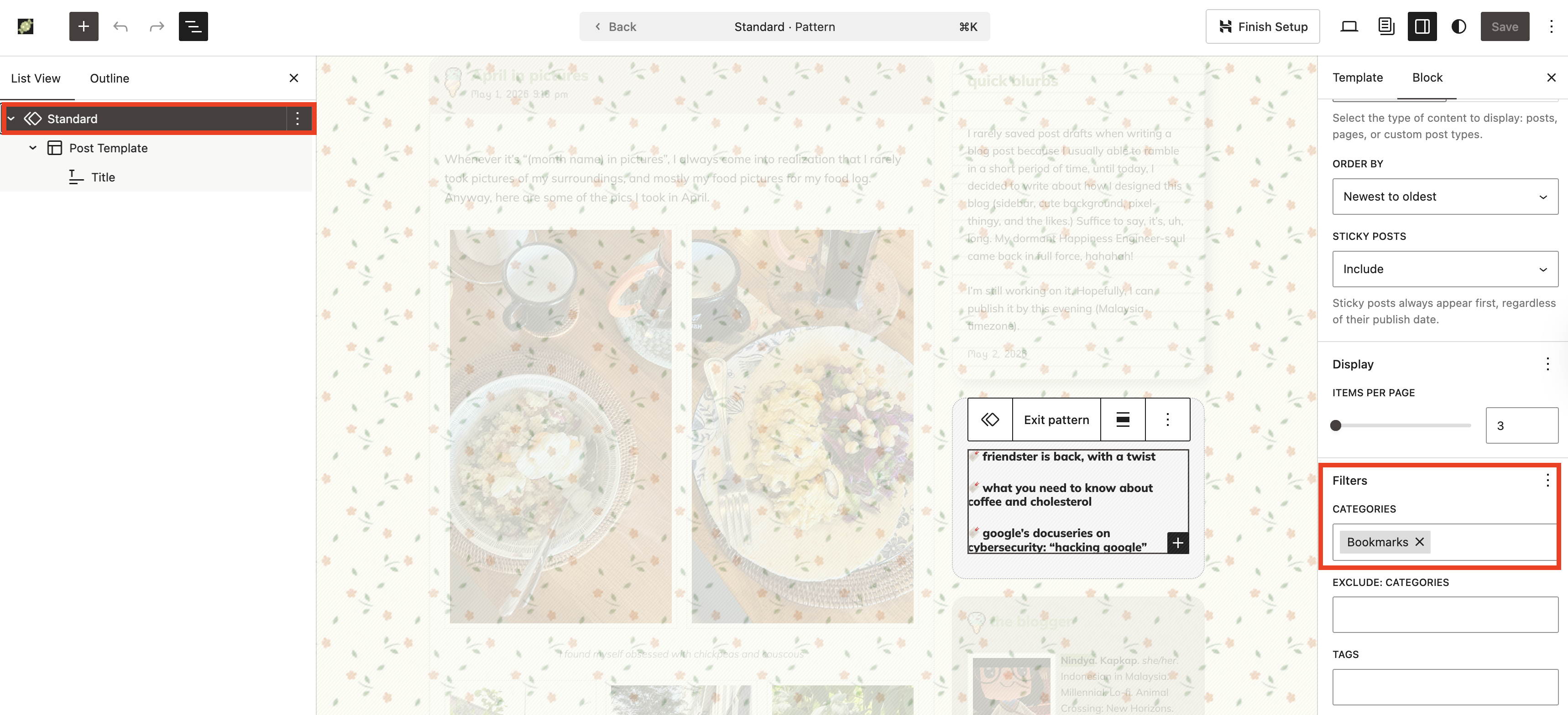
… And so on and so forth (Photoblog, Reading, and Current Tune).
Now! The “The Blogger” part! This part is not using Query Loop Block, as expected. That said, I tinkered with the Group Block to display the ice cream next to the heading text.
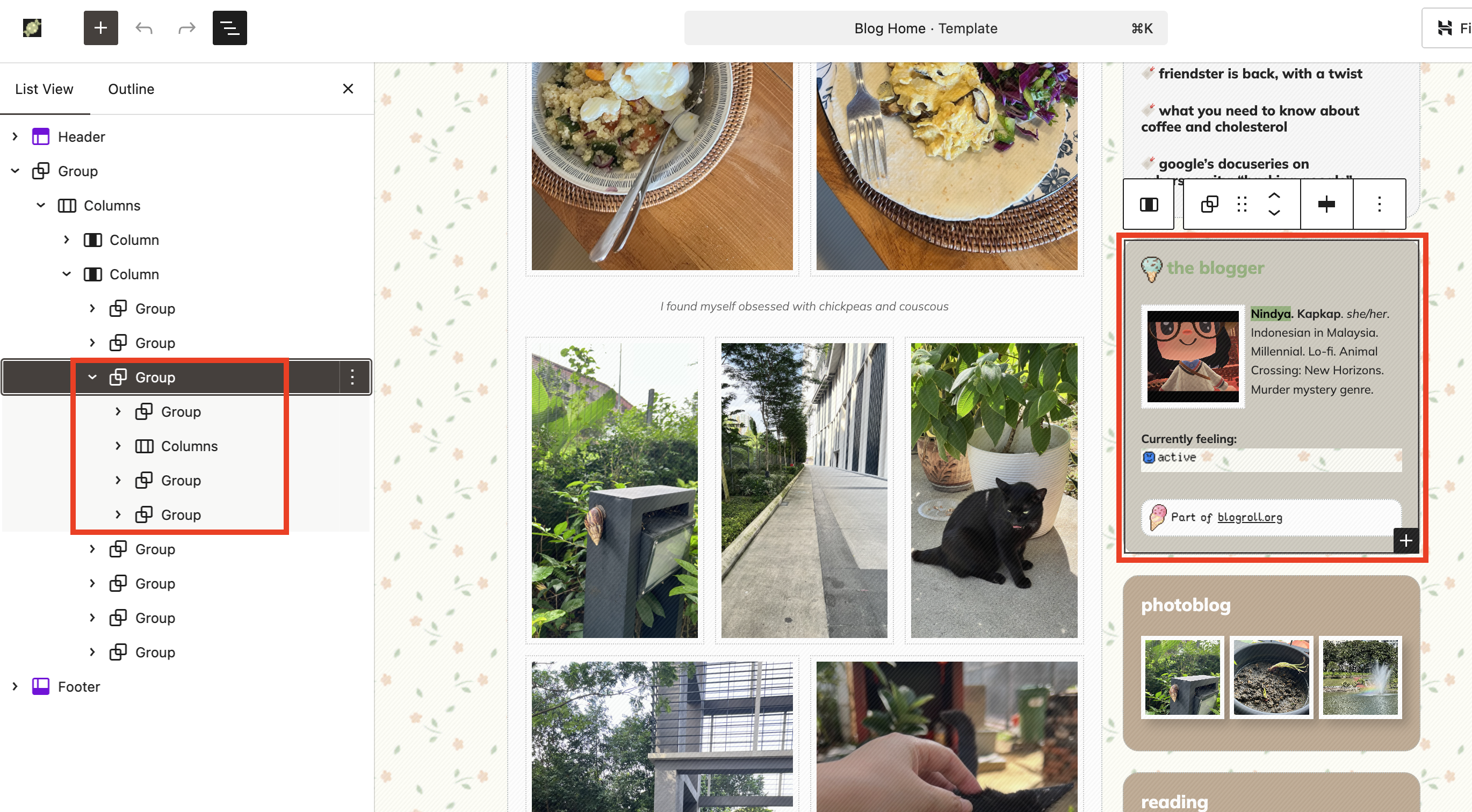
And this is where we are going to the next step/tips: How to Make Your Blog Cuter.
How to make my blog cuter?
We have covered the basics: Displaying blog posts and the sidebar. Next, we go to the “design” aspect of the blog. This is where you can let your personality shine through. I love cute stuff and pixel art, and I want to convey that sweet feeling here. I’m using a floral background and ice cream pixel art. I also use one set to make sure they are uniform and not too overwhelming.
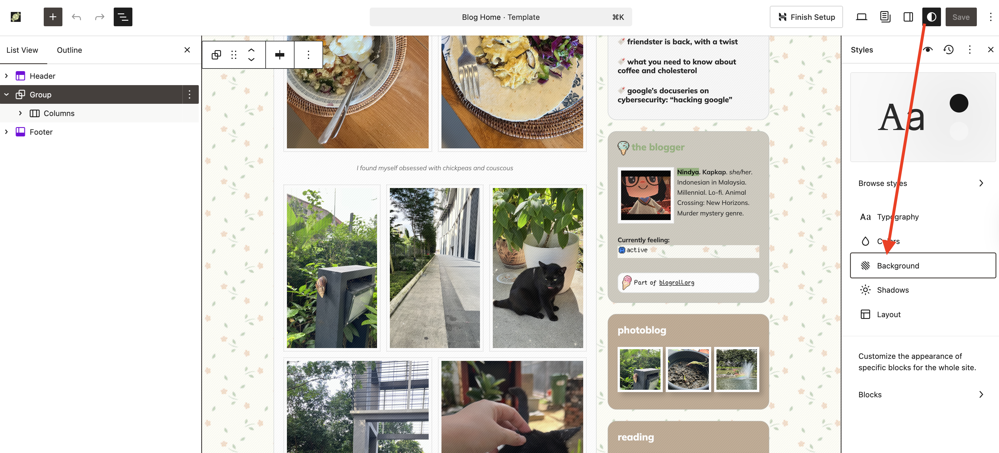
Adding the background to the whole website is a pretty straightforward process. On the Site Editor, click the half-moon icon (? I’m not sure what the actual term is for that icon), then click “Background”. From there, you can add the background image (upload the pattern first to your site, and please avoid hotlinking!) You can also adjust and change the site/blog’s typography, color palette, layout, and even customize the appearance of specific blocks from this area.
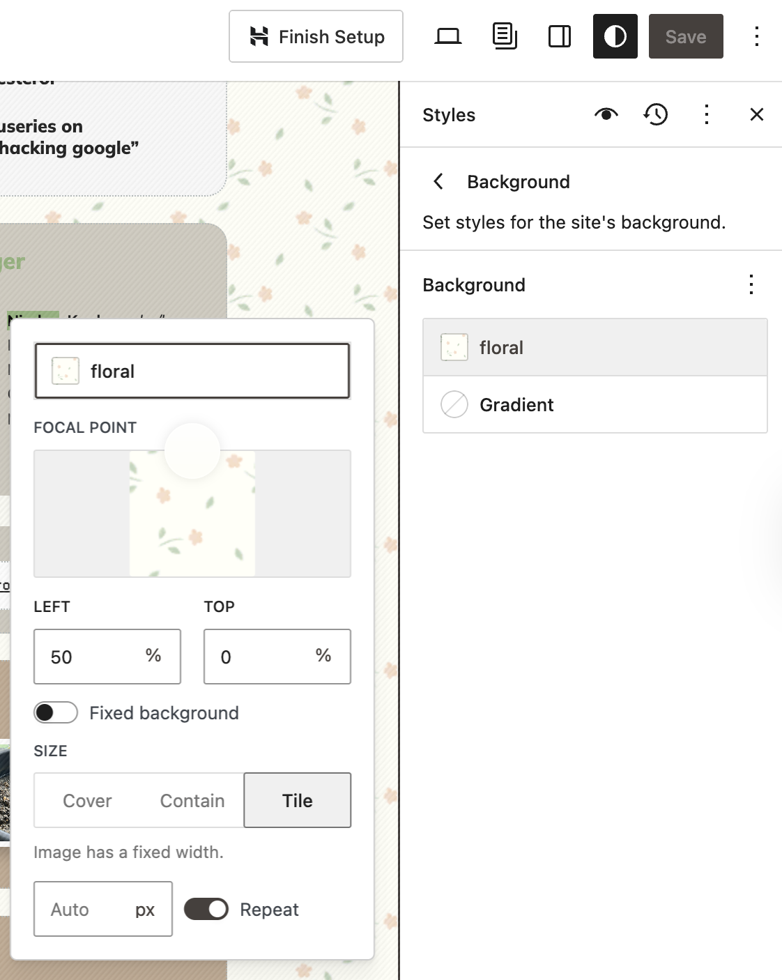
This is how I set the background: Size “Tile” then activate the “Repeat” option.
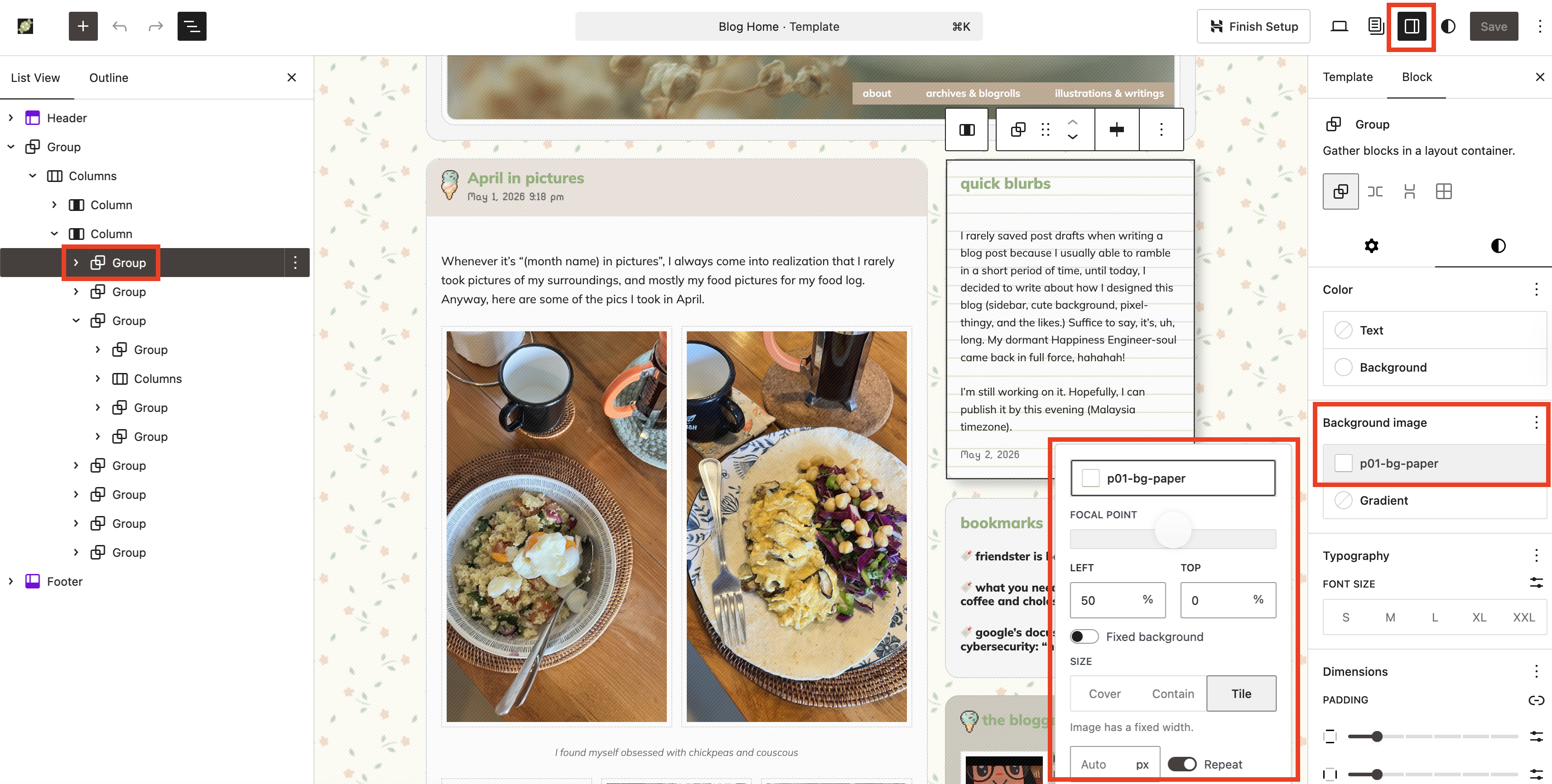
This same method can be applied on Group Block, and that’s what I did on some of the Group Block, most notably the “Quick Blurbs” section on the sidebar. I clicked the Group Block for “Quick Blurbs”, then, I made sure the sidebar is set to Block Settings (the… Uh, square-y icon?) From there, I added a background image that mimics notebook paper.
I also did the same with the Group Block on other pages (here and here.)
Next, the ice cream. Instead of adding Image Block, I’m using the background feature. So what I did was:
- Inside the main Group Block, I added another Group Block. And inside this Group Block (Group Blockception), I added a Heading Block for the title (“The Blogger”).
- Then, I clicked the Group Block that hosted the Heading Block. I then used the ice cream pixel image as the background image, but instead of setting it on repeat, I deactivated the “Repeat” option. I also set the position on Left and Top to 0%, meaning that it will be located on the top left of the Group Block. I also adjusted the image’s width to 20 px to make it smaller so the heading text can stay the same (I don’t fancy large texts on my blog.)
- Then, I set the padding for the right and left side of the Group Block to be 24 px (we can actually set the padding on specific sides, but I’m too lazy.)
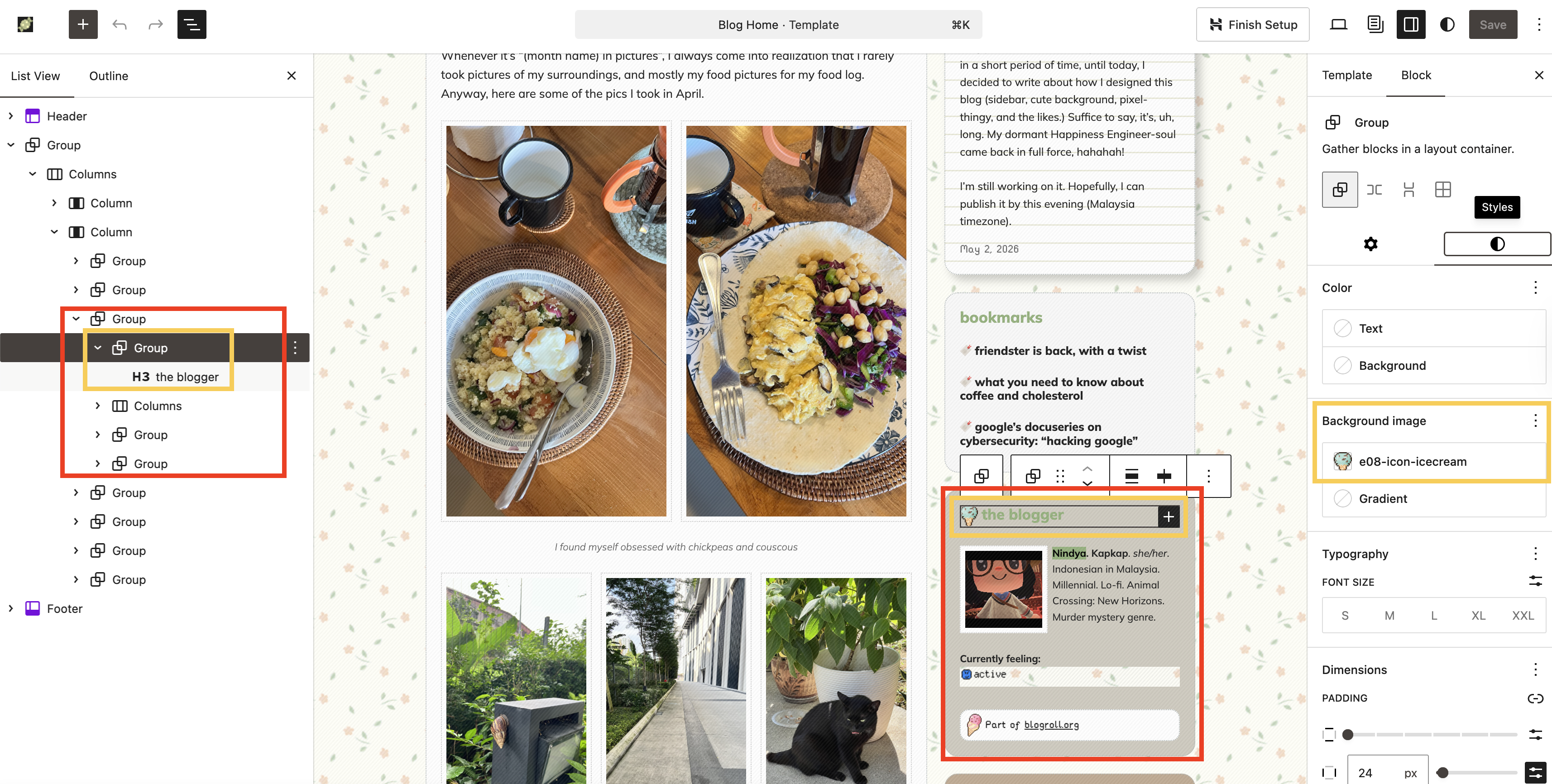
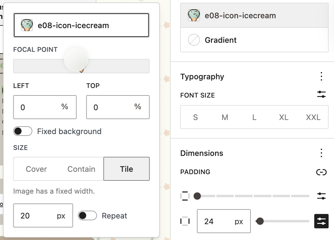
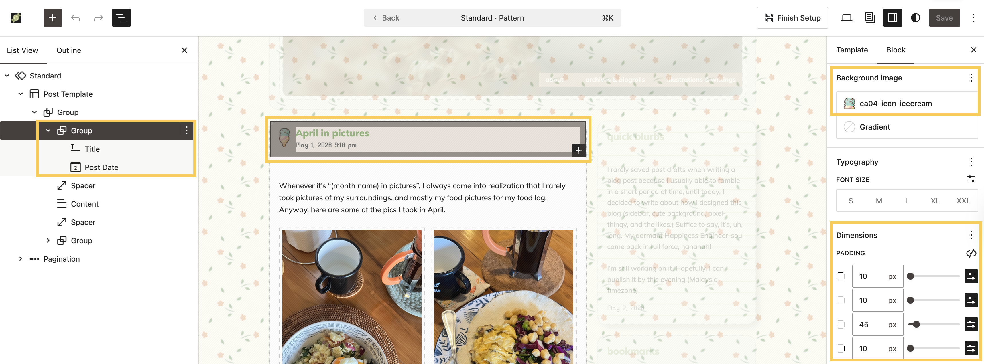
I used the same method on several areas of the website, most notably, the blog post title and post date.
Alright! It’s 10:50 PM now here, and I’m sleepy, ahah. I know I am still missing some areas, but I’m not sure I can cover everything in one blog post. Perhaps just like when I talked about Full Site Editing (the ancestor of Site Editor, hahah!), I can break it into several parts. We’ll see 🙂
If you managed to read this post until this point, thank you, thank you, thank you. I love sharing how-tos on using Block Themes and Site Editor, and I hope this is helpful for you and your blog.